Animated Charts
Advanced
Learning Objectives
After completing this recipe, you will be able to:
- Understand changes over time through animation
- Understand the concepts of Matplotlib Animation
Note: This document is a static page, so we show a single frame (snapshot) of the animation as an example. When actually running the code, you can see the dynamically moving chart.
0. Setup
import numpy as np
import matplotlib.pyplot as plt
import pandas as pd

# Generate data: moving sine wave
x = np.linspace(0, 2*np.pi, 100)
1. Frame Visualization
Let’s visualize a specific point in time of the animation.
plt.figure(figsize=(10, 6))
y = np.sin(x) # t=0
plt.plot(x, y, label='Time=0')

y2 = np.sin(x + np.pi/2) # t=1
plt.plot(x, y2, '--', label='Time=1')

plt.title('Wave Movement Snapshot')
plt.legend()
plt.show()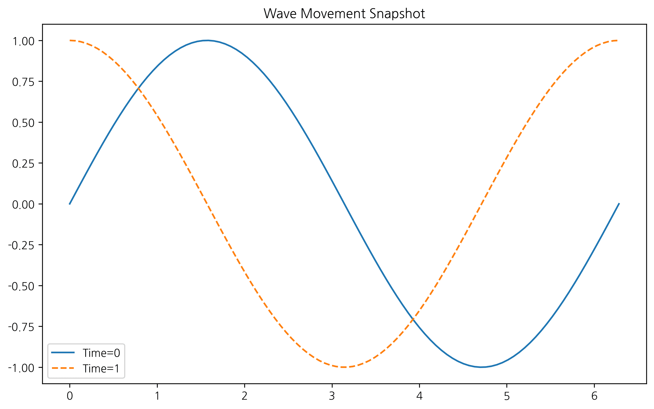
2. Comparing Multiple Time Points
plt.figure(figsize=(10, 6))
for t in np.linspace(0, np.pi, 5):
    plt.plot(x, np.sin(x + t), alpha=0.5, label=f't={t:.2f}')

plt.title('Multiple Time Steps')
plt.legend(bbox_to_anchor=(1.05, 1), loc='upper left')
plt.tight_layout()
plt.show()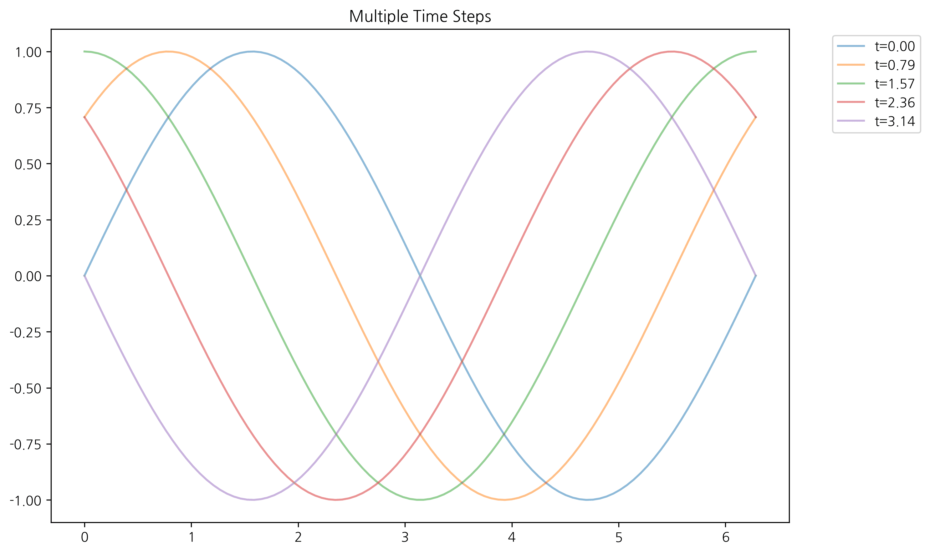
Last updated on