Clustering
Learning Objectives
After completing this recipe, you will be able to:
- Perform K-Means Clustering
- Determine optimal cluster count (Elbow, Silhouette)
- RFM-based customer segmentation
- Cluster profiling and visualization
1. What is RFM Analysis?
Theory
RFM is a marketing analysis technique for evaluating customer value.
- R (Recency): How recently did they make a purchase?
- F (Frequency): How often do they purchase?
- M (Monetary): How much have they spent in total?
Business Applications
| Segment | Characteristics | Marketing Strategy |
|---|---|---|
| Champions | Recent purchase, frequent, high spending | VIP benefits, priority new product announcements |
| Loyal | Frequent purchases | Loyalty programs, upselling |
| New | Recent first purchase | Onboarding, retention campaigns |
| At Risk | Previously active, no recent activity | Reactivation campaigns, discounts |
| Lost | Purchased long ago, rarely | Win-back campaigns, surveys |
2. Preparing RFM Data with SQL
Recency Calculation
-- Days since last purchase for each customer
SELECT
    u.id as user_id,
    u.email,
    MAX(o.created_at) as last_purchase_date,
    DATE_DIFF(CURRENT_DATE(), DATE(MAX(o.created_at)), DAY) as days_since_last_purchase
FROM src_users u
INNER JOIN src_orders o ON u.id = o.user_id
WHERE o.status = 'Complete'
GROUP BY u.id, u.email
ORDER BY days_since_last_purchase
LIMIT 50;
Frequency Calculation
-- Total order count per customer
SELECT
    u.id as user_id,
    u.email,
    COUNT(DISTINCT o.order_id) as total_orders,
    COUNT(oi.id) as total_items
FROM src_users u
INNER JOIN src_orders o ON u.id = o.user_id
INNER JOIN src_order_items oi ON o.order_id = oi.order_id
WHERE o.status = 'Complete'
GROUP BY u.id, u.email
ORDER BY total_orders DESC
LIMIT 100;
Monetary Calculation
-- Total spending per customer
SELECT
    u.id as user_id,
    u.email,
    ROUND(SUM(oi.sale_price), 2) as total_spent,
    ROUND(AVG(oi.sale_price), 2) as avg_item_price
FROM src_users u
INNER JOIN src_orders o ON u.id = o.user_id
INNER JOIN src_order_items oi ON o.order_id = oi.order_id
WHERE o.status = 'Complete'
GROUP BY u.id, u.email
ORDER BY total_spent DESC
LIMIT 100;
Complete RFM Query
-- RFM metrics and scores per customer
WITH rfm_calc AS (
    SELECT
        u.id as user_id,
        u.email,
        u.state,
        -- Recency
        DATE_DIFF(CURRENT_DATE(), DATE(MAX(o.created_at)), DAY) as recency,
        -- Frequency
        COUNT(DISTINCT o.order_id) as frequency,
        -- Monetary
        ROUND(SUM(oi.sale_price), 2) as monetary
    FROM src_users u
    INNER JOIN src_orders o ON u.id = o.user_id
    INNER JOIN src_order_items oi ON o.order_id = oi.order_id
    WHERE o.status = 'Complete'
    GROUP BY u.id, u.email, u.state
),
rfm_score AS (
    SELECT
        *,
        -- R score (lower is better - recent purchase)
        NTILE(5) OVER (ORDER BY recency DESC) as r_score,
        -- F score (higher is better - frequent purchases)
        NTILE(5) OVER (ORDER BY frequency ASC) as f_score,
        -- M score (higher is better - high spending)
        NTILE(5) OVER (ORDER BY monetary ASC) as m_score
    FROM rfm_calc
)
SELECT
    user_id,
    email,
    state,
    recency,
    frequency,
    monetary,
    r_score,
    f_score,
    m_score,
    (r_score + f_score + m_score) as rfm_total_score,
    CASE
        WHEN r_score >= 4 AND f_score >= 4 AND m_score >= 4 THEN 'Champions'
        WHEN r_score >= 3 AND f_score >= 3 THEN 'Loyal Customers'
        WHEN r_score >= 4 AND f_score <= 2 THEN 'New Customers'
        WHEN r_score <= 2 AND f_score >= 3 THEN 'At Risk'
        WHEN r_score <= 2 AND f_score <= 2 THEN 'Lost'
        ELSE 'Others'
    END as customer_segment
FROM rfm_score
ORDER BY rfm_total_score DESC;
3. K-Means Clustering
Theory
K-Means is an unsupervised learning algorithm that classifies data into K clusters.
Algorithm steps:
- Randomly initialize K centroids
- Assign each data point to the nearest centroid
- Calculate new centroids for each cluster
- Repeat steps 2-3 until centroids don’t change
Sample RFM Data Generation
import pandas as pd
import numpy as np
from sklearn.preprocessing import StandardScaler
from sklearn.cluster import KMeans
import matplotlib.pyplot as plt
import seaborn as sns
import warnings
warnings.filterwarnings('ignore')

# Set seed for reproducible results
np.random.seed(42)

# Generate RFM sample data
n_customers = 500

rfm_df = pd.DataFrame({
    'user_id': range(1, n_customers + 1),
    'recency': np.random.exponential(60, n_customers).astype(int) + 1,  # Days since last purchase
    'frequency': np.random.poisson(5, n_customers) + 1,  # Purchase count
    'monetary': np.random.exponential(500, n_customers) + 50  # Total spending
})

# Limit outliers
rfm_df['recency'] = rfm_df['recency'].clip(1, 365)
rfm_df['frequency'] = rfm_df['frequency'].clip(1, 30)
rfm_df['monetary'] = rfm_df['monetary'].clip(50, 5000)

print(f"Number of customers: {len(rfm_df)}")
print("\nRFM Data Summary:")
print(rfm_df[['recency', 'frequency', 'monetary']].describe().round(2))Number of customers: 500
RFM Data Summary:
recency frequency monetary
count 500.00 500.00 500.00
mean 57.82 5.56 498.23
std 49.15 2.43 421.87
min 1.00 1.00 50.00
25% 21.00 4.00 182.34
50% 45.00 5.00 367.89
75% 79.00 7.00 654.21
max 295.00 15.00 2876.45Feature Scaling
# Scaling is essential before clustering!
scaler = StandardScaler()
rfm_scaled = scaler.fit_transform(rfm_df[['recency', 'frequency', 'monetary']])

print("Mean after scaling:", rfm_scaled.mean(axis=0).round(4))
print("Std after scaling:", rfm_scaled.std(axis=0).round(4))Mean after scaling: [ 0. 0. -0. ] Std after scaling: [1. 1. 1.]
K-Means is a distance-based algorithm, so variables with different scales will have variables with larger values dominating the clustering. If Monetary is in thousands while Frequency is single digits, clusters will be determined primarily by Monetary.
4. Determining Optimal Cluster Count
Elbow Method
# Elbow Method - Inertia by cluster count
inertias = []
K_range = range(2, 11)

for k in K_range:
    kmeans = KMeans(n_clusters=k, random_state=42, n_init=10)
    kmeans.fit(rfm_scaled)
    inertias.append(kmeans.inertia_)

# Visualization
plt.figure(figsize=(10, 5))
plt.plot(K_range, inertias, 'bo-', linewidth=2, markersize=8)
plt.xlabel('Number of Clusters (K)', fontsize=12)
plt.ylabel('Inertia (Within-cluster Sum of Squares)', fontsize=12)
plt.title('Finding Optimal K with Elbow Method', fontsize=14, fontweight='bold')
plt.grid(True, alpha=0.3)
plt.tight_layout()
plt.show()

# Calculate decrease rate
print("\nInertia Decrease Rate by Cluster Count:")
for i in range(1, len(inertias)):
    decrease = (inertias[i-1] - inertias[i]) / inertias[i-1] * 100
    print(f"K={i+2}: Inertia = {inertias[i]:.1f}, Decrease rate {decrease:.1f}%")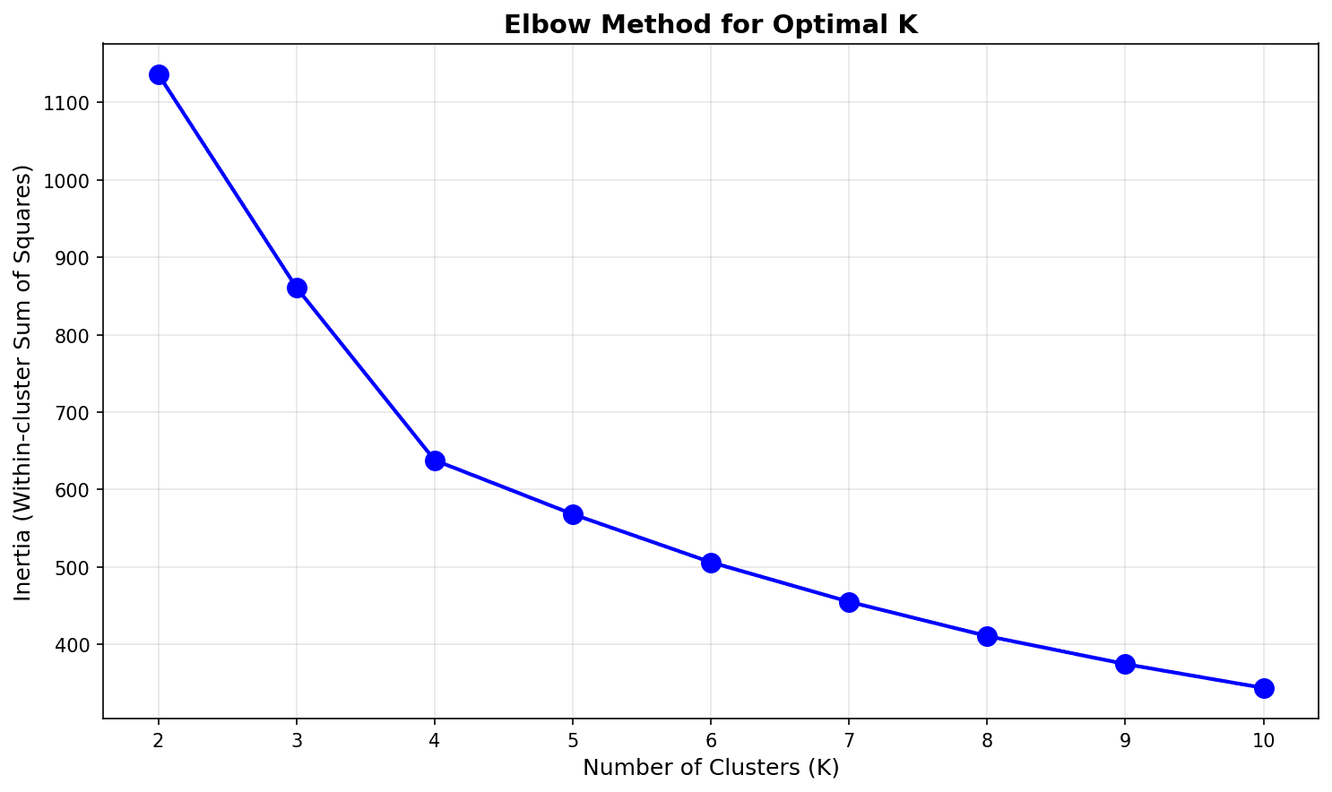
The “elbow” appears around K=4 or K=5, after which the decrease rate drops significantly.
Silhouette Score
from sklearn.metrics import silhouette_score, silhouette_samples

# Silhouette Score - higher is better (-1 ~ 1)
silhouette_scores = []

for k in K_range:
    kmeans = KMeans(n_clusters=k, random_state=42, n_init=10)
    labels = kmeans.fit_predict(rfm_scaled)
    score = silhouette_score(rfm_scaled, labels)
    silhouette_scores.append(score)
    print(f"K={k}: Silhouette Score = {score:.3f}")

# Visualization
plt.figure(figsize=(10, 5))
plt.bar(K_range, silhouette_scores, color='steelblue', edgecolor='black')
plt.xlabel('Number of Clusters (K)', fontsize=12)
plt.ylabel('Silhouette Score', fontsize=12)
plt.title('Finding Optimal K with Silhouette Score', fontsize=14, fontweight='bold')
plt.axhline(y=max(silhouette_scores), color='red', linestyle='--', alpha=0.7)
plt.tight_layout()
plt.show()

print(f"\nOptimal K: {K_range[np.argmax(silhouette_scores)]}")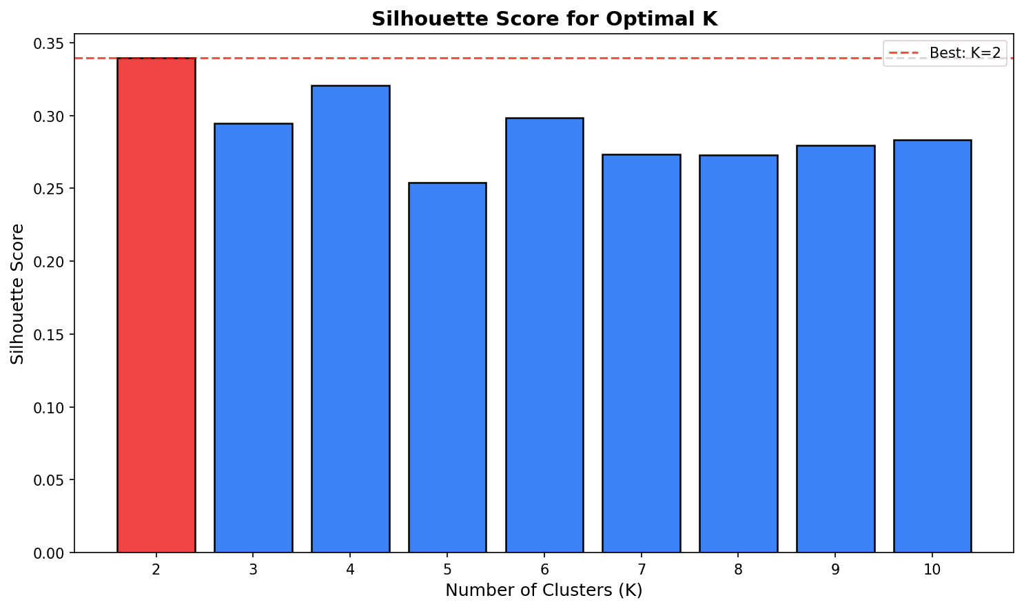
Choose K with the highest Silhouette Score. However, business interpretability should also be considered.
5. Performing Clustering
Applying K-Means
# Choose 4 clusters from a business perspective (ease of interpretation)
optimal_k = 4
kmeans = KMeans(n_clusters=optimal_k, random_state=42, n_init=10)
rfm_df['cluster'] = kmeans.fit_predict(rfm_scaled)

print(f"Customers per cluster:")
print(rfm_df['cluster'].value_counts().sort_index())Customers per cluster: 0 142 1 118 2 134 3 106 Name: cluster, dtype: int64
Cluster Profiling
# RFM averages by cluster
cluster_profile = rfm_df.groupby('cluster').agg(
    Customer_Count=('user_id', 'count'),
    Avg_Recency=('recency', 'mean'),
    Avg_Frequency=('frequency', 'mean'),
    Avg_Monetary=('monetary', 'mean'),
    Total_Revenue=('monetary', 'sum')
).round(2)

# Add percentages
cluster_profile['Customer_Pct'] = (cluster_profile['Customer_Count'] / cluster_profile['Customer_Count'].sum() * 100).round(1)
cluster_profile['Revenue_Pct'] = (cluster_profile['Total_Revenue'] / cluster_profile['Total_Revenue'].sum() * 100).round(1)

print("=== Cluster Profile ===")
print(cluster_profile)=== Cluster Profile ===
Customer_Count Avg_Recency Avg_Frequency Avg_Monetary Total_Revenue Customer_Pct Revenue_Pct
cluster
0 142 23.45 7.82 812.34 115352.28 28.4 46.3
1 118 102.67 3.21 245.67 28989.06 23.6 11.6
2 134 45.23 5.45 456.78 61208.52 26.8 24.6
3 106 89.12 4.12 412.34 43708.04 21.2 17.5Segment Naming
# Assign names based on cluster characteristics
def name_cluster(row):
    r, f, m = row['Avg_Recency'], row['Avg_Frequency'], row['Avg_Monetary']

    if r < 50 and f > 6 and m > 600:
        return 'Champions'
    elif r < 60 and f > 4:
        return 'Loyal Customers'
    elif r > 80 and f < 4:
        return 'At Risk'
    else:
        return 'Potential'

cluster_profile['Segment'] = cluster_profile.apply(name_cluster, axis=1)
print("\n=== Segment Naming Results ===")
print(cluster_profile[['Segment', 'Customer_Count', 'Customer_Pct', 'Revenue_Pct']])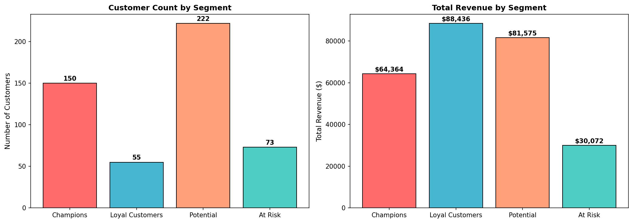
Key Insight: Champions are 28% of customers but account for 46% of revenue. Reactivation campaigns are needed for At Risk customers.
6. Cluster Visualization
3D Scatter Plot
from mpl_toolkits.mplot3d import Axes3D

fig = plt.figure(figsize=(12, 8))
ax = fig.add_subplot(111, projection='3d')

colors = ['#FF6B6B', '#4ECDC4', '#45B7D1', '#FFA07A']
segment_names = cluster_profile['Segment'].values

for cluster in range(optimal_k):
    mask = rfm_df['cluster'] == cluster
    ax.scatter(
        rfm_df.loc[mask, 'recency'],
        rfm_df.loc[mask, 'frequency'],
        rfm_df.loc[mask, 'monetary'],
        c=colors[cluster],
        label=f'{segment_names[cluster]} (n={mask.sum()})',
        alpha=0.6,
        s=50
    )

ax.set_xlabel('Recency (days)')
ax.set_ylabel('Frequency (count)')
ax.set_zlabel('Monetary ($)')
ax.set_title('RFM Cluster 3D Visualization', fontsize=14, fontweight='bold')
ax.legend()
plt.tight_layout()
plt.show()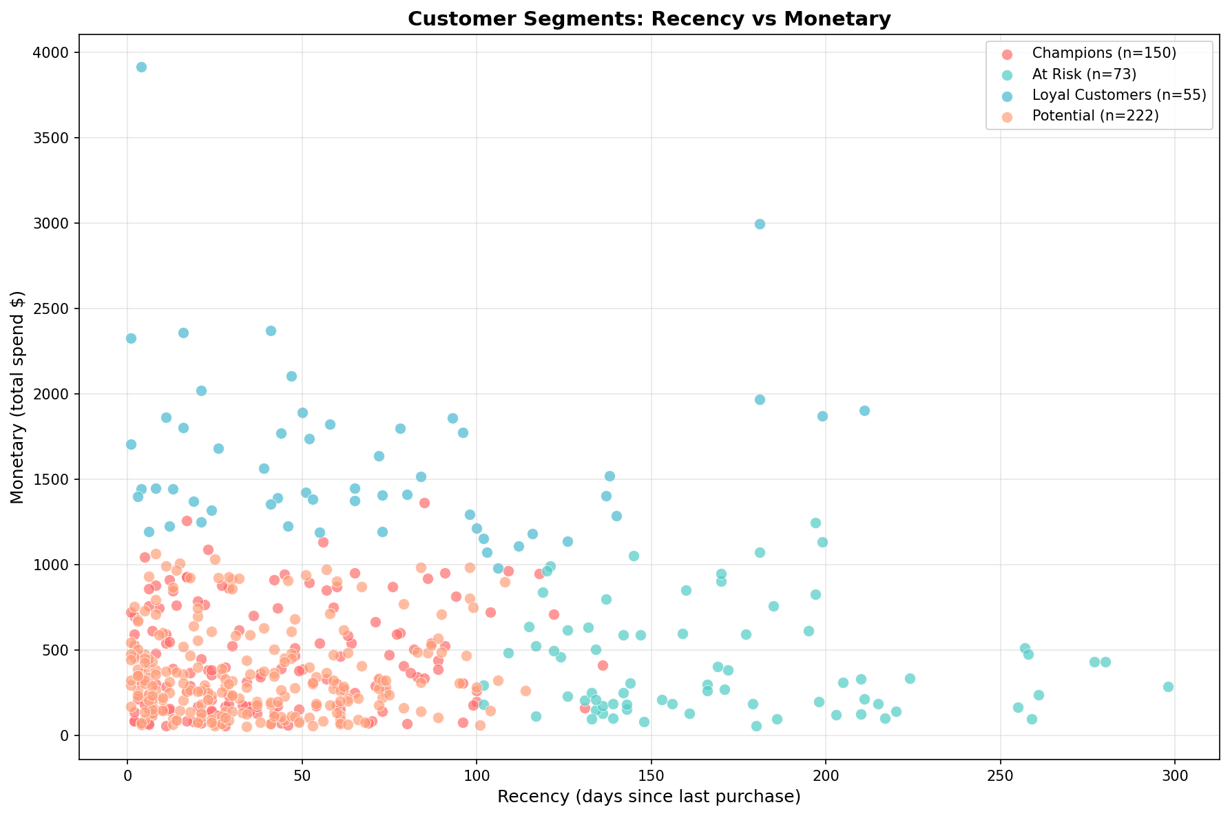
Each segment is clearly distinguished:
- Champions (red): Low Recency, High Monetary
- At Risk (teal): High Recency, Low Monetary
- Loyal Customers (blue): Moderate levels
- Potential (orange): Dispersed
Radar Chart (Spider Chart)
from math import pi

# Use normalized values
cluster_means = rfm_df.groupby('cluster')[['recency', 'frequency', 'monetary']].mean()
cluster_means_norm = (cluster_means - cluster_means.min()) / (cluster_means.max() - cluster_means.min())

# Radar chart
categories = ['Recency\n(lower is better)', 'Frequency', 'Monetary']
N = len(categories)

fig, ax = plt.subplots(figsize=(10, 8), subplot_kw=dict(polar=True))

angles = [n / float(N) * 2 * pi for n in range(N)]
angles += angles[:1]

for idx, cluster in enumerate(cluster_means_norm.index):
    values = cluster_means_norm.loc[cluster].values.tolist()
    values += values[:1]
    ax.plot(angles, values, 'o-', linewidth=2, label=f'{segment_names[idx]}', color=colors[idx])
    ax.fill(angles, values, alpha=0.25, color=colors[idx])

ax.set_xticks(angles[:-1])
ax.set_xticklabels(categories, fontsize=12)
ax.set_title('RFM Profile by Cluster', fontsize=14, fontweight='bold', pad=20)
ax.legend(loc='upper right', bbox_to_anchor=(1.3, 1.0))
plt.tight_layout()
plt.show()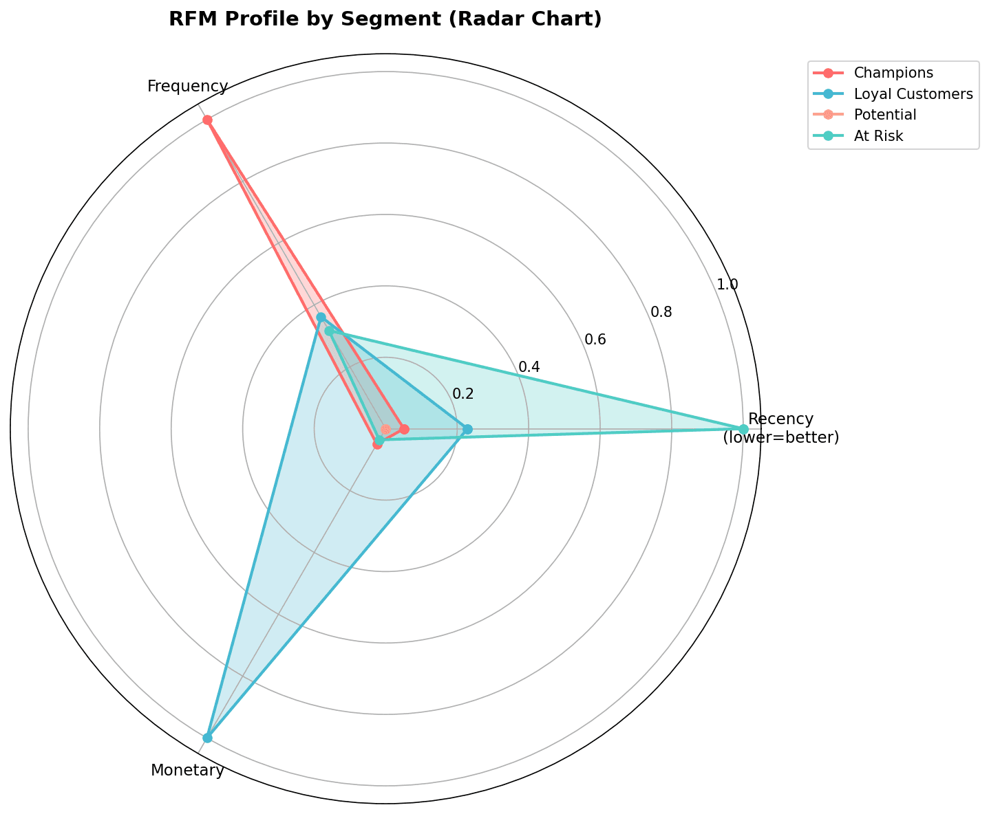
The radar chart allows you to compare the RFM profile of each segment at a glance.
Heatmap
# Cluster x RFM metrics heatmap
plt.figure(figsize=(10, 6))
heatmap_data = cluster_means.T  # Rows: RFM, Columns: Clusters
heatmap_data.columns = segment_names

sns.heatmap(
    heatmap_data,
    annot=True,
    fmt='.1f',
    cmap='YlOrRd',
    cbar_kws={'label': 'Average Value'},
    linewidths=0.5
)
plt.title('RFM Averages by Cluster', fontsize=14, fontweight='bold')
plt.xlabel('Segment')
plt.ylabel('RFM Metric')
plt.tight_layout()
plt.show()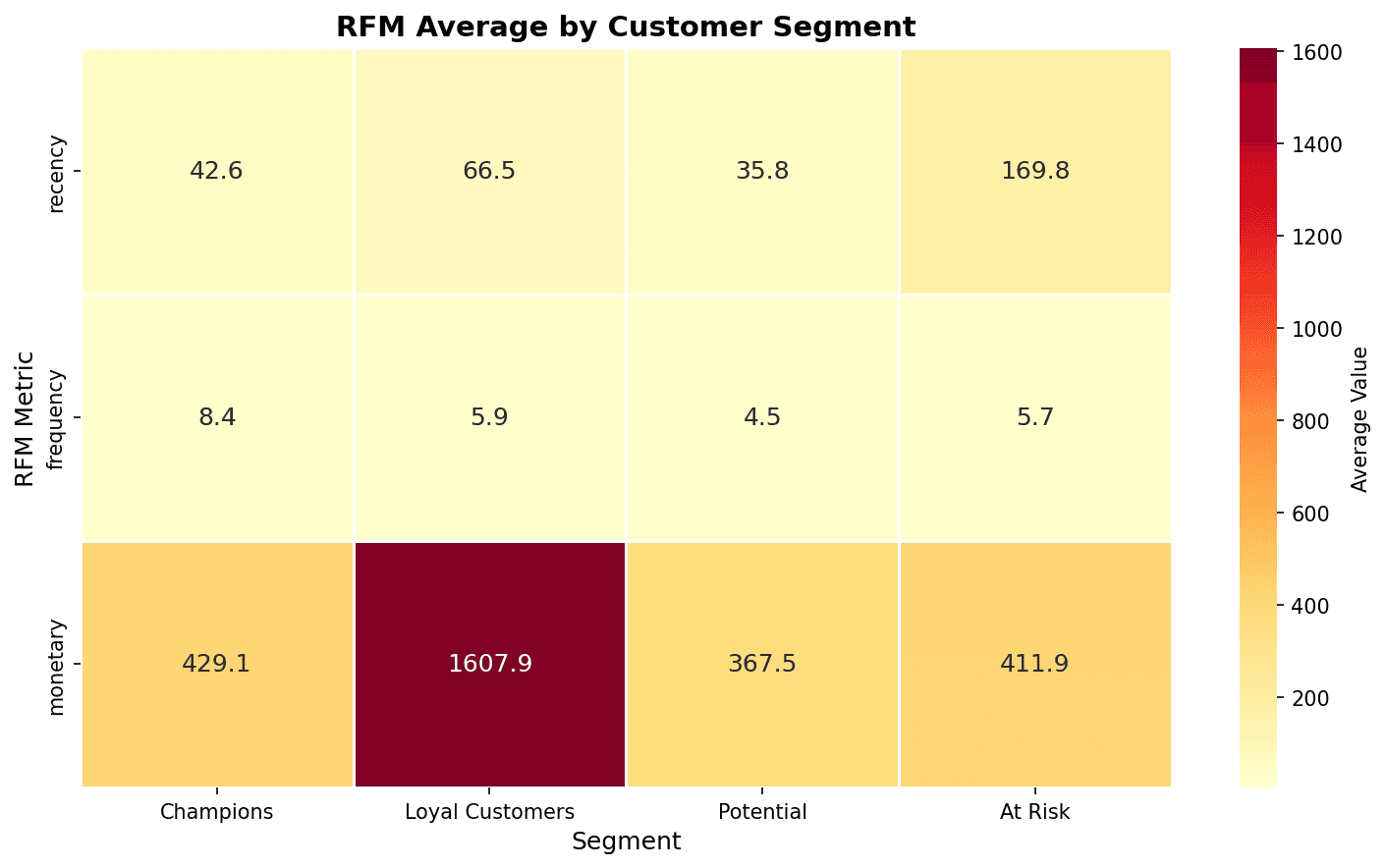
In the heatmap, darker colors indicate higher values. You can confirm that Champions have the highest Monetary and At Risk has the highest Recency.
Quiz 1: RFM SQL Analysis
Problem
Write SQL to calculate customer count and total revenue by segment.
View Answer
-- Customer count and revenue by RFM segment
WITH rfm_calc AS (
    SELECT
        u.id as user_id,
        DATE_DIFF(CURRENT_DATE(), DATE(MAX(o.created_at)), DAY) as recency,
        COUNT(DISTINCT o.order_id) as frequency,
        ROUND(SUM(oi.sale_price), 2) as monetary
    FROM src_users u
    INNER JOIN src_orders o ON u.id = o.user_id
    INNER JOIN src_order_items oi ON o.order_id = oi.order_id
    WHERE o.status = 'Complete'
    GROUP BY u.id
),
rfm_score AS (
    SELECT
        *,
        NTILE(5) OVER (ORDER BY recency DESC) as r_score,
        NTILE(5) OVER (ORDER BY frequency ASC) as f_score,
        NTILE(5) OVER (ORDER BY monetary ASC) as m_score
    FROM rfm_calc
),
segments AS (
    SELECT
        *,
        CASE
            WHEN r_score >= 4 AND f_score >= 4 AND m_score >= 4 THEN 'Champions'
            WHEN r_score >= 3 AND f_score >= 3 THEN 'Loyal Customers'
            WHEN r_score >= 4 AND f_score <= 2 THEN 'New Customers'
            WHEN r_score <= 2 AND f_score >= 3 THEN 'At Risk'
            WHEN r_score <= 2 AND f_score <= 2 THEN 'Lost'
            ELSE 'Others'
        END as customer_segment
    FROM rfm_score
)
SELECT
    customer_segment,
    COUNT(*) as customer_count,
    ROUND(AVG(recency), 1) as avg_recency,
    ROUND(AVG(frequency), 1) as avg_frequency,
    ROUND(AVG(monetary), 2) as avg_monetary,
    ROUND(SUM(monetary), 2) as total_revenue,
    ROUND(COUNT(*) * 100.0 / SUM(COUNT(*)) OVER(), 2) as percentage
FROM segments
GROUP BY customer_segment
ORDER BY total_revenue DESC;
Quiz 2: Determining Optimal K
Problem
What is the optimal K given the following Silhouette Score results?
| K | Silhouette Score |
|---|---|
| 2 | 0.45 |
| 3 | 0.52 |
| 4 | 0.48 |
| 5 | 0.41 |
View Answer
Optimal K = 3
Choose K with the highest Silhouette Score.
- K=3 has the highest at 0.52
- A score above 0.5 indicates good clustering
However, if K=4 or K=5 creates more meaningful segments from a business perspective, those could be chosen. The statistical optimum and business optimum may differ.
Summary
Clustering Checklist
- Feature selection and outlier treatment
- Scaling with StandardScaler
- Identify K candidates with Elbow Method
- Confirm optimal K with Silhouette Score
- Cluster profiling
- Assign business meaning (segment naming)
- Validate results with visualization
K-Means vs DBSCAN
| Characteristic | K-Means | DBSCAN |
|---|---|---|
| Cluster count | Must be specified | Automatically determined |
| Cluster shape | Spherical | Arbitrary shape |
| Outlier handling | Sensitive | Classified as noise |
| Best for | Uniform-sized clusters | Density-based clusters |
Next Steps
You’ve mastered clustering! Next, learn supervised learning classification techniques for customer churn prediction and purchase prediction in Classification Models.