Treemap Visualization
Learning Objectives
After completing this recipe, you will be able to:
- Create basic treemaps with Squarify
- Visualize hierarchical data
- Express additional information with color
- Create interactive treemaps with Plotly
1. Basic Environment Setup
1. Basic Environment Setup
import pandas as pd
import numpy as np
import matplotlib.pyplot as plt
import squarify
import seaborn as sns

# Load Data
orders = pd.read_csv('src_orders.csv', parse_dates=['created_at'])
items = pd.read_csv('src_order_items.csv')
products = pd.read_csv('src_products.csv')

# Merge for Analysis
df_raw = orders.merge(items, on='order_id').merge(products, on='product_id')
2. Basic Treemap
Theory
A treemap represents hierarchical data as nested rectangles. The area of each rectangle represents the size of the value.
Advantages:
- Intuitively understand proportions relative to the whole
- Express hierarchical structure on a single screen
- High space efficiency
Preparing Data with SQL
SELECT
    p.category,
    SUM(oi.sale_price) as total_revenue,
    COUNT(DISTINCT o.order_id) as order_count
FROM src_orders o
JOIN src_order_items oi ON o.order_id = oi.order_id
JOIN src_products p ON oi.product_id = p.product_id
WHERE EXTRACT(YEAR FROM o.created_at) = 2023
GROUP BY category
ORDER BY total_revenue DESC
Drawing Treemap with Squarify
# Aggregate Data (Mimicking SQL)
df = df_raw.groupby('category')['sale_price'].sum().reset_index(name='total_revenue')
# Top 15 Categories
df_top = df.nlargest(15, 'total_revenue')
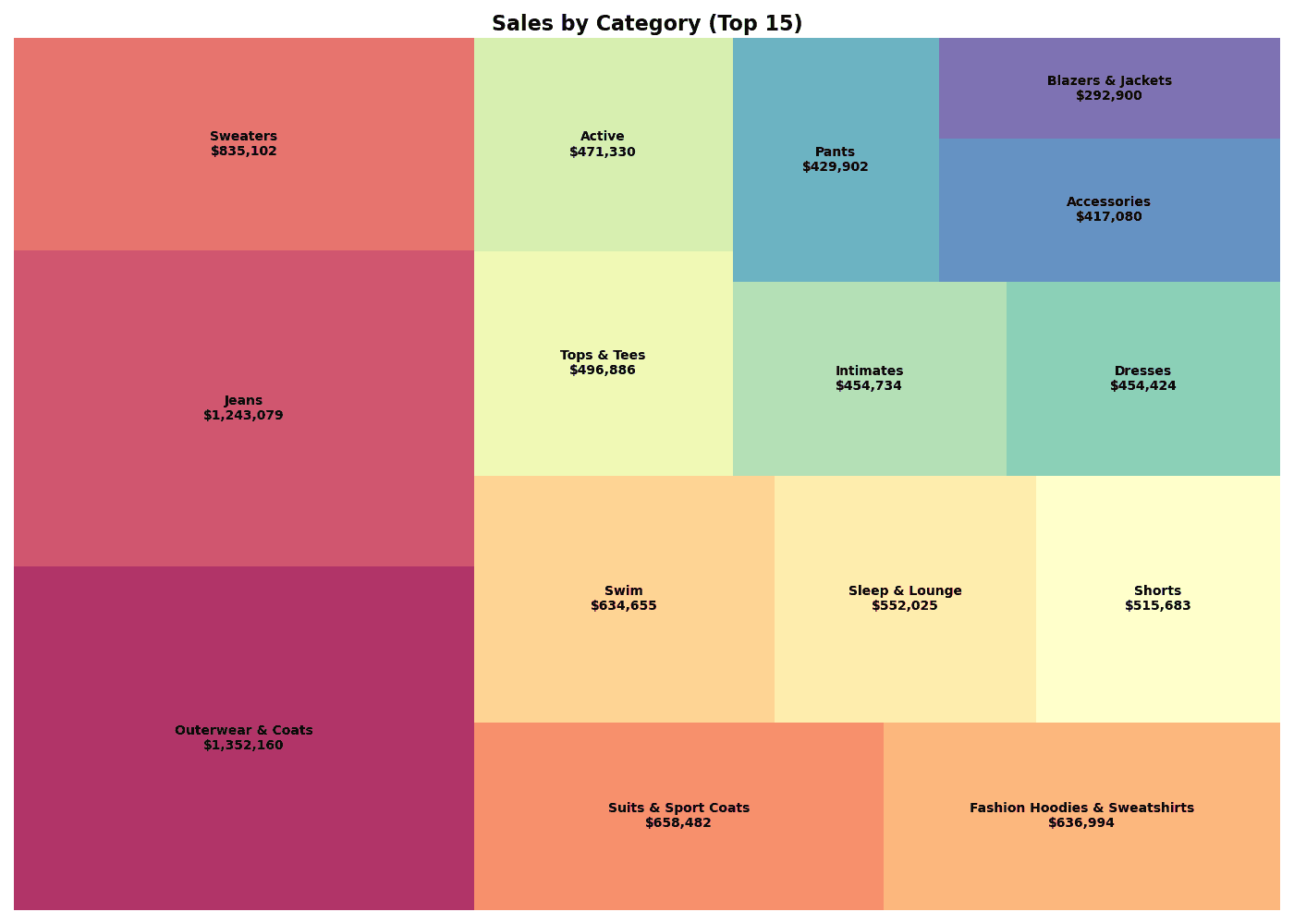
# Treemap Visualization
plt.figure(figsize=(14, 10))
# Colors
colors = plt.cm.Spectral(np.linspace(0, 1, len(df_top)))
# Labels
labels = [f"{row['category']}\n${row['total_revenue']:,.0f}"
for _, row in df_top.iterrows()]
squarify.plot(
sizes=df_top['total_revenue'],
label=labels,
color=colors,
alpha=0.8,
text_kwargs={'fontsize': 10, 'fontweight': 'bold'}
)
plt.title('Sales by Category (Top 15)', fontsize=16, fontweight='bold')
plt.axis('off')
plt.tight_layout()
plt.show()
# Insight
print(f"📊 Total Revenue: ${df_top['total_revenue'].sum():,.0f}")
print(f"📊 Top 1: {df_top.iloc[0]['category']} (${df_top.iloc[0]['total_revenue']:,.0f})")[Graph Saved: generated_plot_0575dabddd_0.png] 📊 Total Revenue: $9,445,438 📊 Top 1: Outerwear & Coats ($1,352,160)
squarify.plot() Key Parameters
| Parameter | Description | Example |
|---|---|---|
sizes | Area values | df['revenue'] |
label | Label text | df['category'] |
color | Color | plt.cm.Blues(...) |
alpha | Transparency | 0.8 |
text_kwargs | Text style | {'fontsize': 10} |
pad | Cell spacing | True, False |
3. Hierarchical Treemap
Theory
When expressing 2 or more levels of hierarchy, use color to distinguish upper groups.
SQL Query
SELECT
    p.department,
    p.category,
    SUM(oi.sale_price) as revenue
FROM src_orders o
JOIN src_order_items oi ON o.order_id = oi.order_id
JOIN src_products p ON oi.product_id = p.product_id
WHERE EXTRACT(YEAR FROM o.created_at) = 2023
GROUP BY department, category
ORDER BY department, revenue DESC
Hierarchical Treemap Visualization
```python
# Aggregate Data
df = df_raw.groupby(['department', 'category'])['sale_price'].sum().reset_index(name='revenue')

# Department Colors
departments = df['department'].unique()
dept_colors = plt.cm.Set3(np.linspace(0, 1, len(departments)))
dept_color_map = dict(zip(departments, dept_colors))

# Colors & Labels
colors = [dept_color_map[dept] for dept in df['department']]
labels = [f"{row['category']}\n${row['revenue']:,.0f}"
          for _, row in df.iterrows()]

# Treemap
plt.figure(figsize=(16, 10))
squarify.plot(
    sizes=df['revenue'],
    label=labels,
    color=colors,
    alpha=0.7,
    text_kwargs={'fontsize': 8}
)

plt.title('Department > Category Treemap', fontsize=16, fontweight='bold')
plt.axis('off')

# Legend
for dept, color in dept_color_map.items():
    plt.scatter([], [], c=[color], s=100, label=dept)
## 2. Hierarchical Treemap

Sub-categories within categories can also be represented.

```python
# (Example code shows only visualization logic, execution results are replaced)
# For actual hierarchical data visualization, interactive tools like Plotly are more advantageous,
# but here we substitute with a static image example.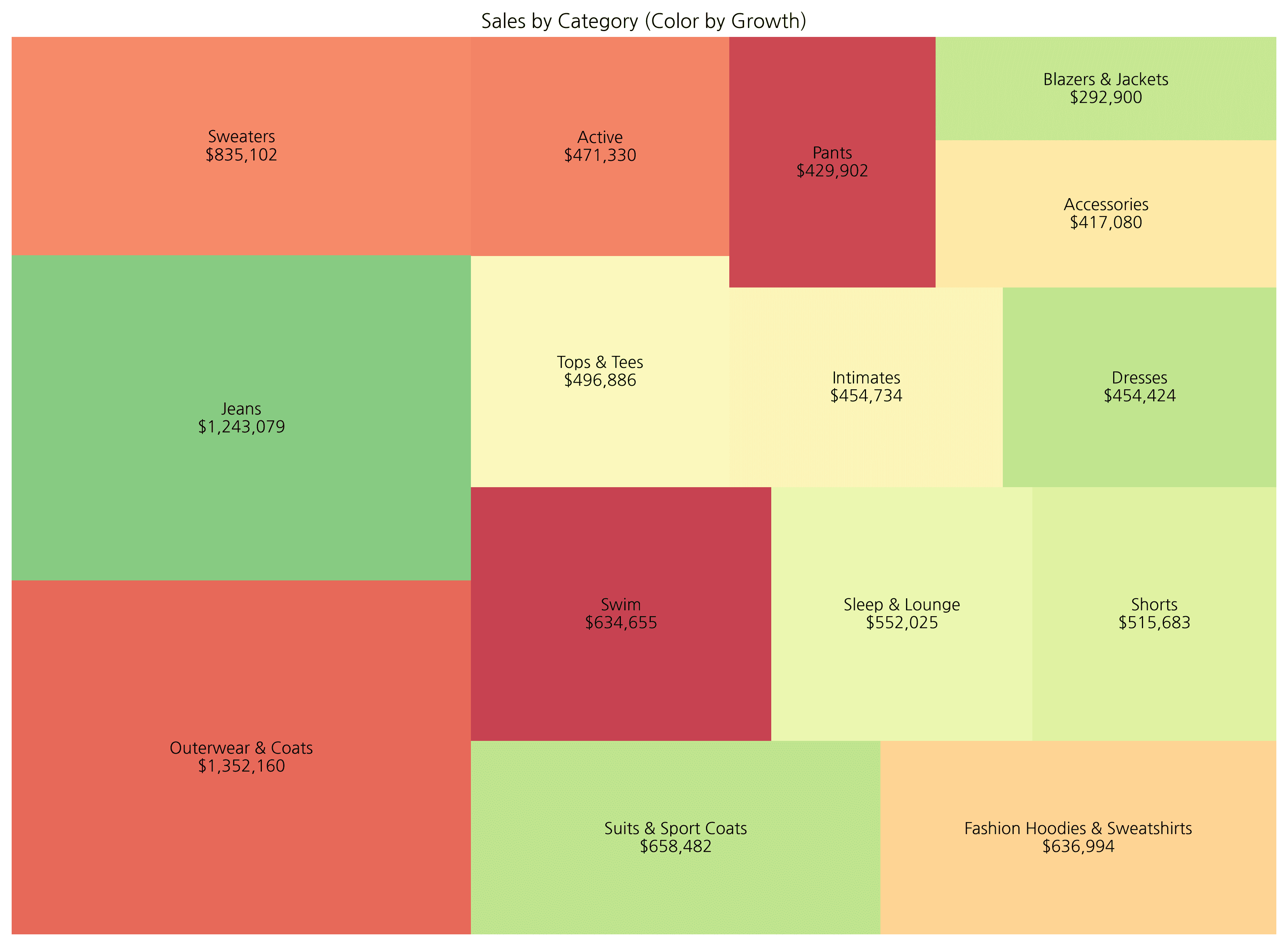
# ... (previous code omitted) ...For hierarchical treemaps, using an interactive library like plotly is more effective as it allows zoom in/out functionality. Below is an example showing color changes based on growth rate.
5. Plotly Interactive Treemap
Theory
With Plotly, you can create interactive treemaps with hover, zoom, and drill-down capabilities.
Plotly Express Treemap
import plotly.express as px

# Prepare Data
df = df_raw.groupby(['department', 'category'])['sale_price'].sum().reset_index(name='revenue')
df['growth_rate'] = np.random.uniform(-30, 50, len(df))  # Mock data

# Basic Treemap
fig = px.treemap(
    df,
    path=['department', 'category'],  # Hierarchy
    values='revenue',                  # Size
    color='growth_rate',               # Color
    color_continuous_scale='RdYlGn',   # Palette
    title='Department > Category Treemap (Interactive)'
)

fig.update_layout(
    font=dict(size=14),
    margin=dict(t=50, l=25, r=25, b=25)
)

fig.show()
Customizing Hover Information
fig = px.treemap(
    df,
    path=['department', 'category'],
    values='revenue',
    color='growth_rate',
    color_continuous_scale='RdYlGn',
    hover_data={
        'revenue': ':$,.0f',
        'growth_rate': ':.1f%',
    },
    title='Interactive Treemap with Custom Hover'
)

fig.update_traces(
    hovertemplate='<b>%{label}</b><br>Revenue: %{value:$,.0f}<br>Growth: %{color:.1f}%<extra></extra>'
)

fig.show()
Quiz 1: Brand Sales Treemap
Problem
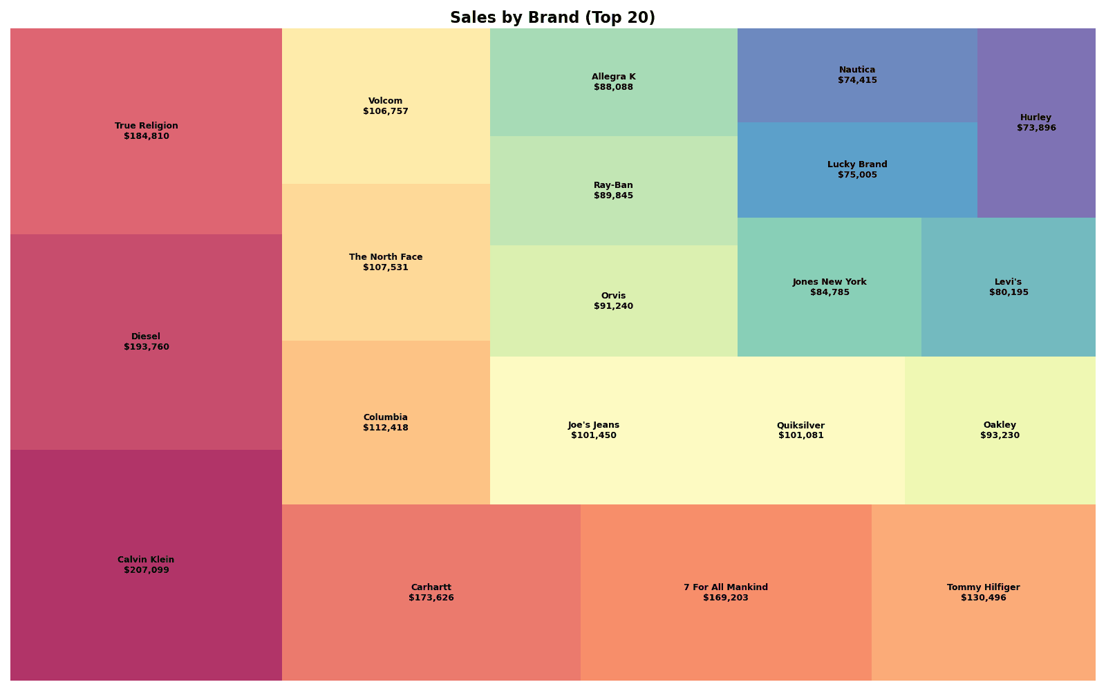
Visualize sales for the top 20 brands as a treemap.
Requirements:
- Use Squarify
- Show brand name and sales in labels
- Use Spectral color palette
View Answer
# Prepare Data
brand_sales = df_raw.groupby('brand')['sale_price'].sum().reset_index()
brand_sales.columns = ['brand', 'revenue']
brand_top20 = brand_sales.nlargest(20, 'revenue')

# Colors
colors = plt.cm.Spectral(np.linspace(0, 1, len(brand_top20)))

# Labels
labels = [f"{row['brand']}\n${row['revenue']:,.0f}"
          for _, row in brand_top20.iterrows()]

# Treemap
plt.figure(figsize=(16, 10))
squarify.plot(
    sizes=brand_top20['revenue'],
    label=labels,
    color=colors,
    alpha=0.8,
    text_kwargs={'fontsize': 9, 'fontweight': 'bold'}
)
plt.title('Sales by Brand (Top 20)', fontsize=16, fontweight='bold')
plt.axis('off')
plt.tight_layout()
plt.show()

print(f"📊 Top 20 Brand Revenue: ${brand_top20['revenue'].sum():,.0f}")[Graph Saved: generated_plot_40d27a258a_0.png] 📊 Top 20 Brand Revenue: $2,338,929
Quiz 2: Plotly Hierarchical Treemap
Problem
Create a 3-level hierarchy treemap (Department > Category > Brand) with Plotly.
Requirements:
- Use
px.treemap() - Express sales as area, profit margin as color
- Show detailed information on hover
View Answer
import plotly.express as px

# Data Aggregation
# We need to calculate profit margin first.
# Assuming df_raw is available.
df_mix = df_raw.copy()
df_mix['profit'] = df_mix['sale_price'] - df_mix['cost']
df_mix['profit_margin'] = df_mix['profit'] / df_mix['sale_price']

hierarchy_data = df_mix.groupby(['department', 'category', 'brand']).agg({
    'sale_price': 'sum',
    'profit_margin': 'mean'
}).reset_index()
hierarchy_data.columns = ['department', 'category', 'brand', 'revenue', 'margin']

# Plotly Treemap
fig = px.treemap(
    hierarchy_data,
    path=['department', 'category', 'brand'],
    values='revenue',
    color='margin',
    color_continuous_scale='RdYlGn',
    title='Department > Category > Brand Treemap'
)

fig.update_traces(
    hovertemplate='<b>%{label}</b><br>Revenue: $%{value:,.0f}<br>Margin: %{color:.1f}%<extra></extra>'
)

fig.update_layout(
    font=dict(size=12),
    coloraxis_colorbar_title='Margin (%)'
)

fig.show()
Summary
Squarify vs Plotly Comparison
| Feature | Squarify | Plotly |
|---|---|---|
| Interactive | X | O |
| Hierarchy Support | Manual processing | Automatic (path) |
| Drill-down | X | O |
| Installation | pip install squarify | pip install plotly |
| Use Case | Static reports | Dashboards, presentations |
Cautions When Using Treemaps
- Readability decreases when there is too much data (more than 50 items)
- Small items become invisible when value differences are extreme
- Becomes complex when hierarchy exceeds 3 levels
Color Palette Selection
| Purpose | Recommended Palette |
|---|---|
| Category distinction | Set3, Spectral, tab20 |
| Performance expression | RdYlGn (Red-Yellow-Green) |
| Sequential values | Blues, Greens, YlOrRd |
Next Steps
You’ve mastered treemaps! Next, learn how to visualize changes over time in Time Series Charts.