Basic Charts
Beginner
Learning Objectives
After completing this recipe, you will be able to:
- Compare categories with Bar Charts
- Visualize time series changes with Line Charts
- Identify relationships between two variables with Scatter Plots
- Check composition ratios with Pie Charts
- Examine data distribution with Histograms
0. Setup
import pandas as pd
import numpy as np
import matplotlib.pyplot as plt
import seaborn as sns

# Font settings (adjust based on environment, proceeding with English here)
plt.rcParams['font.family'] = 'sans-serif'
plt.rcParams['axes.unicode_minus'] = False

# Generate data
np.random.seed(42)
df = pd.DataFrame({
    'category': ['A', 'B', 'C', 'D', 'E'],
    'value': [23, 45, 12, 67, 34],
    'value2': [20, 40, 15, 60, 30]
})

# Time series data
dates = pd.date_range(start='2023-01-01', periods=100)
ts_df = pd.DataFrame({
    'date': dates,
    'sales': np.random.randn(100).cumsum() + 100,
    'visitors': np.random.randn(100).cumsum() + 50
})
1. Bar Chart
Used to compare the size of categorical data.
plt.figure(figsize=(10, 6))
sns.barplot(x='category', y='value', data=df)
plt.title('Category Values')
plt.show()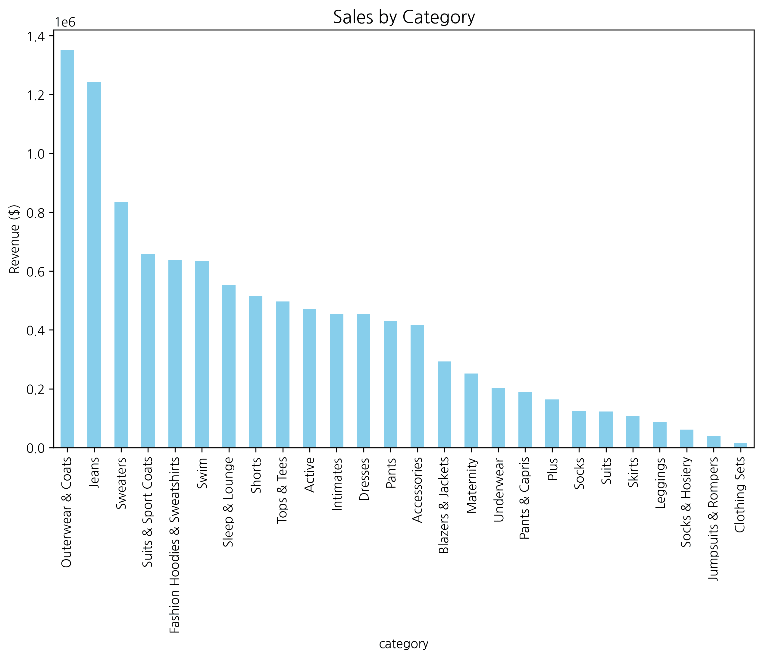
Horizontal Bar Chart
Useful when labels are long or for expressing rankings.
plt.figure(figsize=(10, 6))
sns.barplot(x='value', y='category', data=df, orient='h')
plt.title('Horizontal Bar Chart')
plt.show()
2. Line Chart
Used to show trends over time.
plt.figure(figsize=(12, 6))
sns.lineplot(x='date', y='sales', data=ts_df, label='Sales')
sns.lineplot(x='date', y='visitors', data=ts_df, label='Visitors')
plt.title('Sales & Visitors Trend')
plt.legend()
plt.show()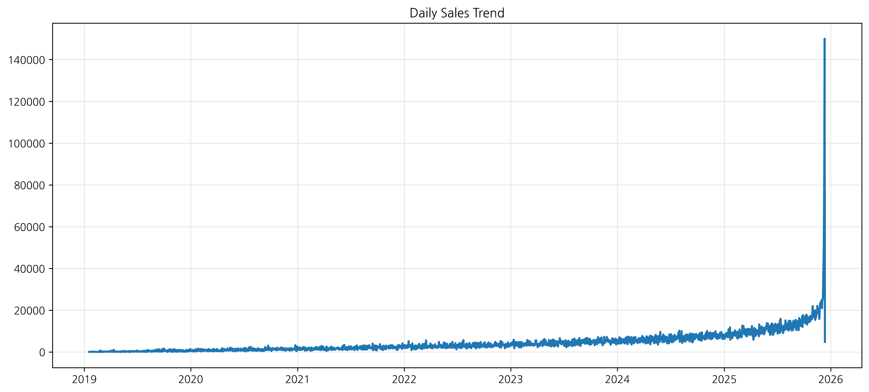
3. Scatter Plot
Shows the correlation between two continuous variables.
# Generate data for scatter plot
scatter_df = pd.DataFrame({
    'x': np.random.randn(100),
    'y': np.random.randn(100)
})
scatter_df['y'] = scatter_df['x'] * 2 + np.random.randn(100) * 0.5  # Create correlation

plt.figure(figsize=(8, 8))
sns.scatterplot(x='x', y='y', data=scatter_df)
plt.title('Scatter Plot')
plt.show()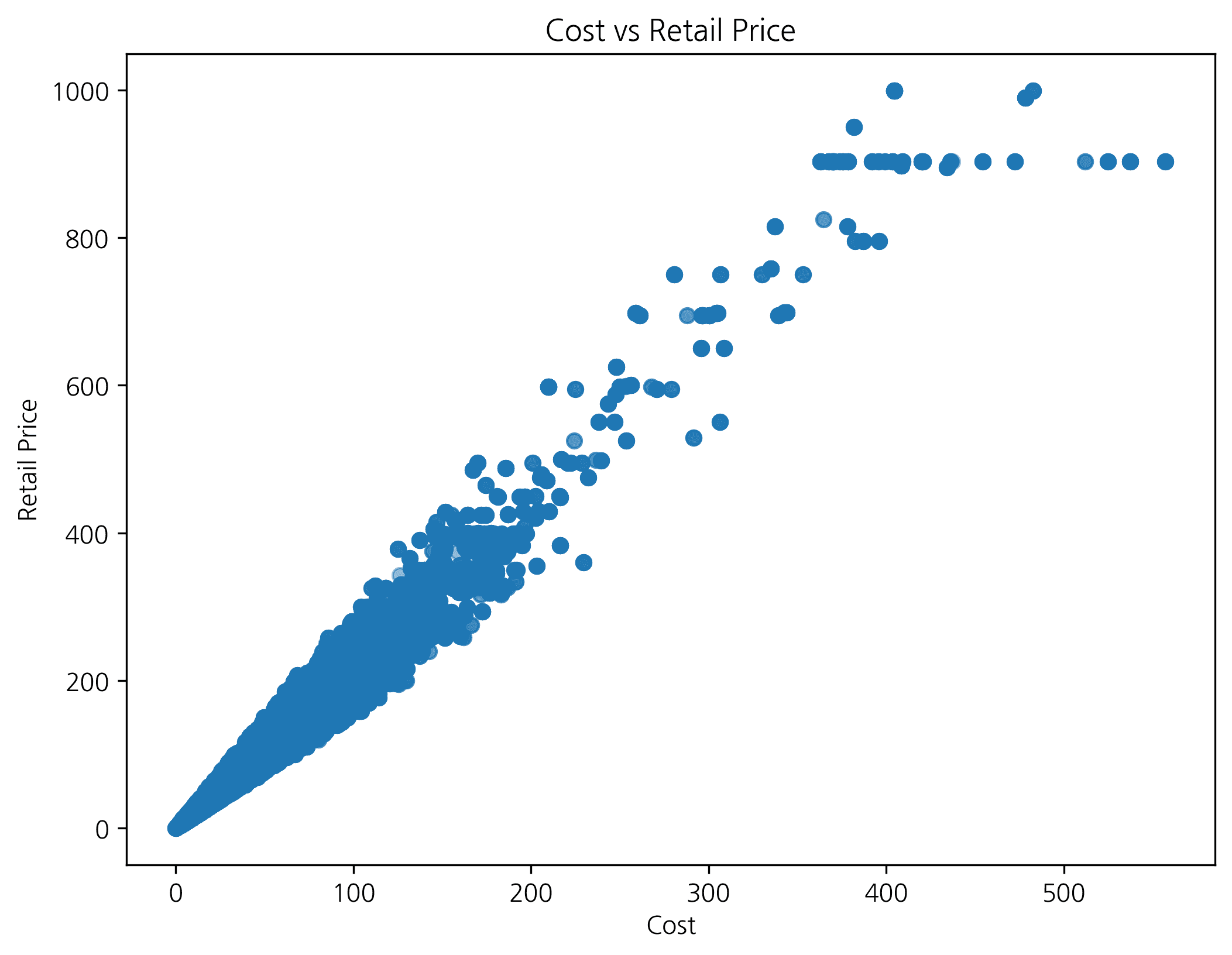
4. Histogram
Shows the frequency distribution of data.
plt.figure(figsize=(10, 6))
sns.histplot(scatter_df['y'], kde=True)  # kde=True: add density curve
plt.title('Distribution')
plt.show()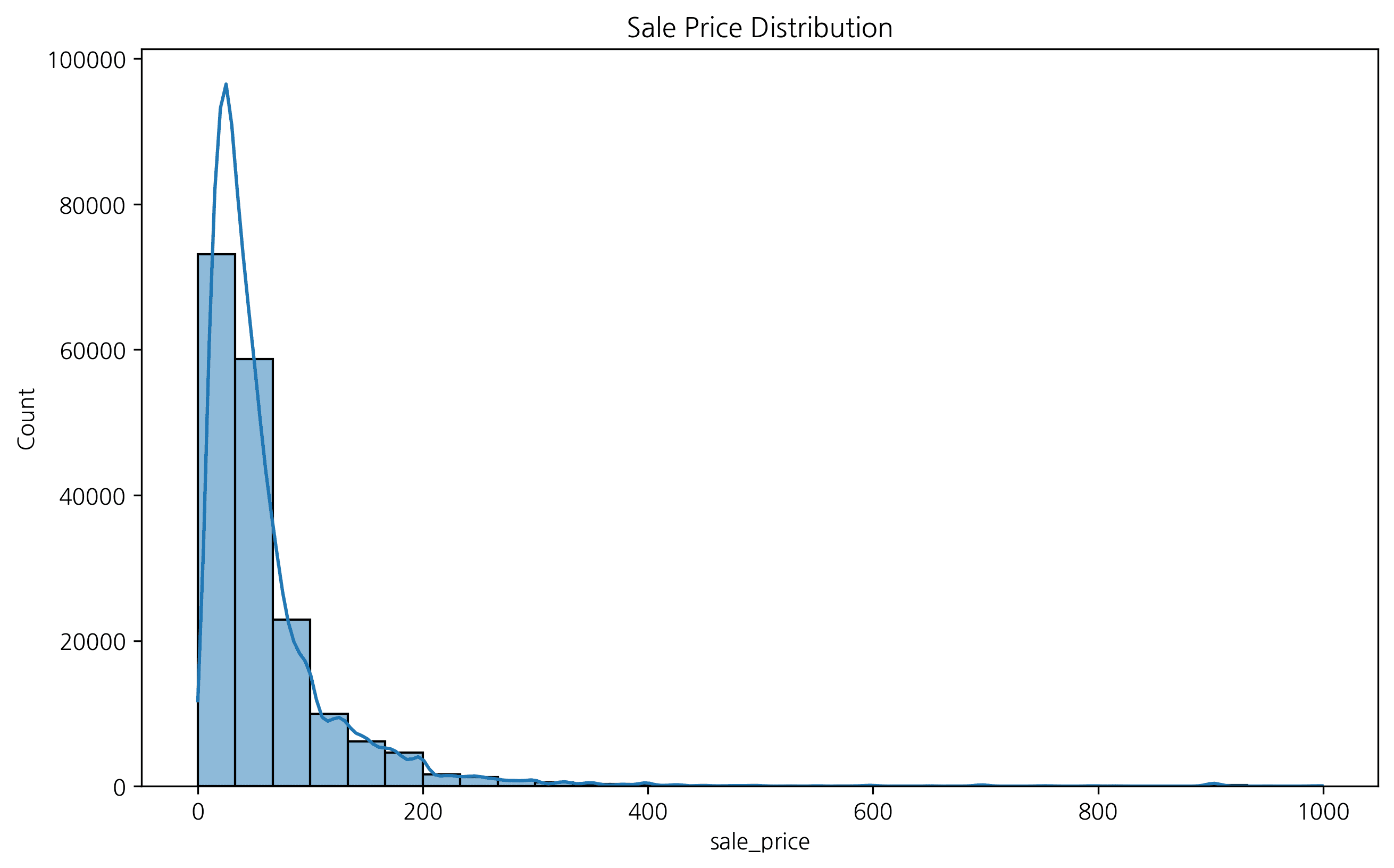
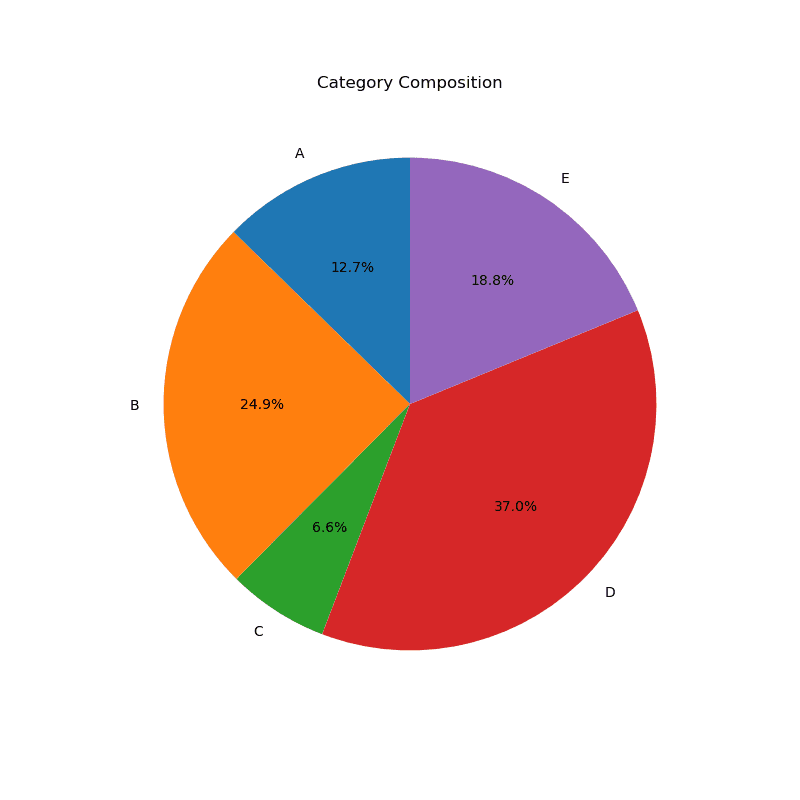
5. Pie Chart
Shows the proportion relative to the whole. (Seaborn doesn’t support pie charts, so matplotlib is used)
plt.figure(figsize=(8, 8))
plt.pie(df['value'], labels=df['category'], autopct='%1.1f%%', startangle=90)
plt.title('Category Composition')
plt.show()
실행 결과
[Graph Saved: generated_plot_c84ab52daf_0.png]
Last updated on