Time Series Charts
Intermediate
Learning Objectives
After completing this recipe, you will be able to:
- Create basic line charts
- Compare multiple time series
- Display moving averages and trends
- Create interactive charts with Plotly
0. Setup
Load CSV files for data practice.
import pandas as pd
import matplotlib.pyplot as plt

# Load Data
orders = pd.read_csv('src_orders.csv', parse_dates=['created_at'])
items = pd.read_csv('src_order_items.csv')
products = pd.read_csv('src_products.csv')

# Merge for Analysis
df = orders.merge(items, on='order_id').merge(products, on='product_id')

# Ensure datetime conversion
df['created_at'] = pd.to_datetime(df['created_at'], format='mixed')
1. Basic Line Chart
Matplotlib Basics
import pandas as pd
import matplotlib.pyplot as plt

# Daily sales data
daily_sales = df.groupby(df['created_at'].dt.date)['sale_price'].sum()

# Basic line chart
plt.figure(figsize=(14, 6))
plt.plot(daily_sales.index, daily_sales.values, linewidth=2, color='steelblue')
plt.title('Daily Sales Trend', fontsize=16, fontweight='bold')
plt.xlabel('Date', fontsize=12)
plt.ylabel('Sales ($)', fontsize=12)
plt.grid(True, alpha=0.3)
plt.xticks(rotation=45)
plt.tight_layout()
plt.show()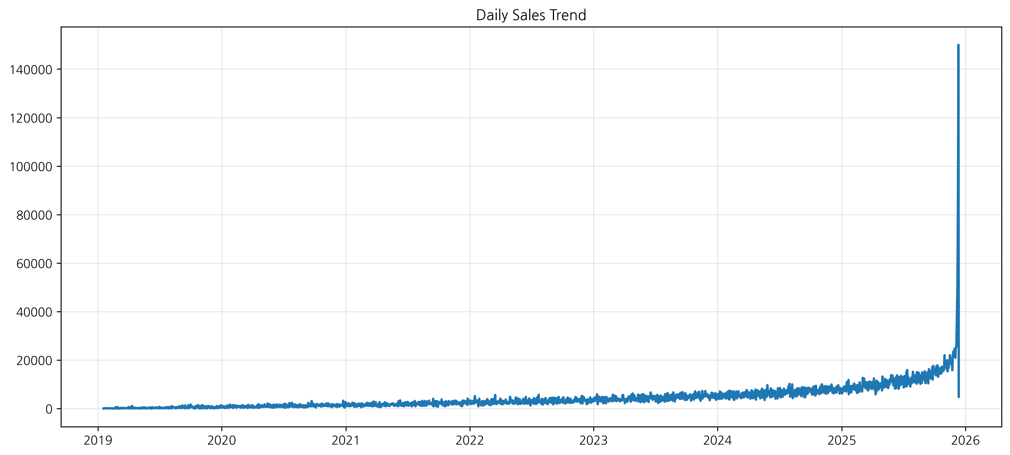
2. Styling Options
You can improve readability by changing line styles, markers, colors, etc.
plt.figure(figsize=(14, 6))

plt.plot(daily_sales.index, daily_sales.values,
         color='green',
         linestyle='--',
         marker='o',
         markersize=8,
         label='Daily Sales')

plt.title('Daily Sales Trend (Styled)', fontsize=16, fontweight='bold')
plt.xlabel('Date', fontsize=12)
plt.ylabel('Sales ($)', fontsize=12)
plt.grid(True, alpha=0.3, linestyle='-.')
plt.legend()

plt.show()
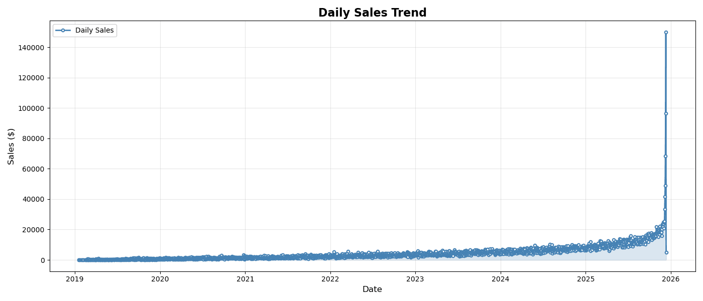
Styling Options
plt.figure(figsize=(14, 6))

plt.plot(
    daily_sales.index,
    daily_sales.values,
    linewidth=2,
    color='steelblue',
    marker='o',           # Add marker
    markersize=4,
    markerfacecolor='white',
    markeredgewidth=1.5,
    label='Daily Sales'
)

plt.fill_between(
    daily_sales.index,
    daily_sales.values,
    alpha=0.2,           # Fill area
    color='steelblue'
)

plt.title('Daily Sales Trend', fontsize=16, fontweight='bold')
plt.xlabel('Date', fontsize=12)
plt.ylabel('Sales ($)', fontsize=12)
plt.legend()
plt.grid(True, alpha=0.3)
plt.tight_layout()
plt.show()
실행 결과
[Graph Saved: generated_plot_38d08c04e4_0.png]
2. Multiple Time Series Comparison
Overlapping Multiple Lines
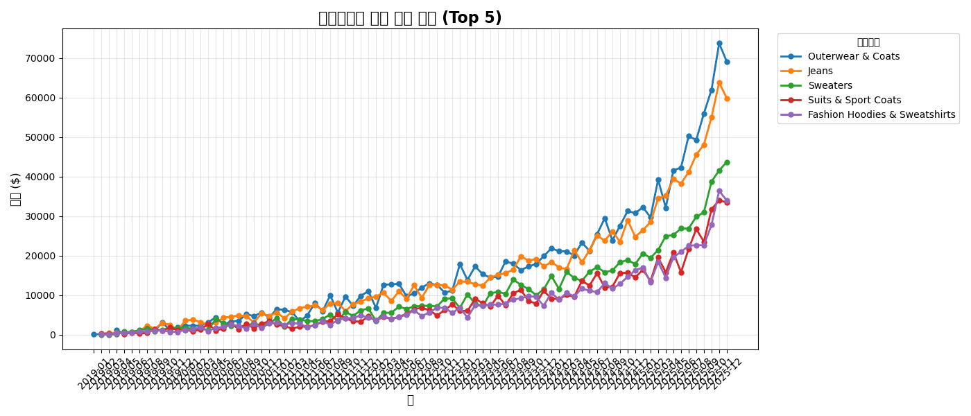
# Monthly sales by category
category_monthly = df.groupby([
    df['created_at'].dt.to_period('M'),
    'category'
])['sale_price'].sum().unstack()

# Top 5 categories
top_5 = df.groupby('category')['sale_price'].sum().nlargest(5).index
category_monthly = category_monthly[top_5]

# Multiple line chart
plt.figure(figsize=(14, 6))

for col in category_monthly.columns:
    plt.plot(
        category_monthly.index.astype(str),
        category_monthly[col],
        marker='o',
        linewidth=2,
        markersize=5,
        label=col
    )

plt.title('Monthly Sales Trend by Category (Top 5)', fontsize=16, fontweight='bold')
plt.xlabel('Month', fontsize=12)
plt.ylabel('Sales ($)', fontsize=12)
plt.legend(title='Category', bbox_to_anchor=(1.02, 1), loc='upper left')
plt.xticks(rotation=45)
plt.grid(True, alpha=0.3)
plt.tight_layout()
plt.show()
실행 결과
[Graph Saved: generated_plot_7d30c61072_0.png]
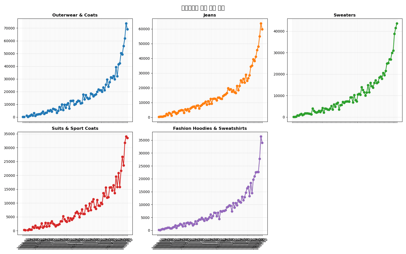
Separating with Subplots
fig, axes = plt.subplots(2, 3, figsize=(16, 10), sharex=True)
axes = axes.flatten()

for i, col in enumerate(top_5):
    ax = axes[i]
    ax.plot(category_monthly.index.astype(str), category_monthly[col],
            marker='o', linewidth=2, color=f'C{i}')
    ax.set_title(col, fontsize=12, fontweight='bold')
    ax.grid(True, alpha=0.3)
    ax.tick_params(axis='x', rotation=45)

# Hide empty subplots
for j in range(len(top_5), len(axes)):
    axes[j].set_visible(False)

fig.suptitle('Monthly Sales Trend by Category', fontsize=16, fontweight='bold')
plt.tight_layout()
plt.show()
실행 결과
[Graph Saved: generated_plot_ac6a666484_0.png]
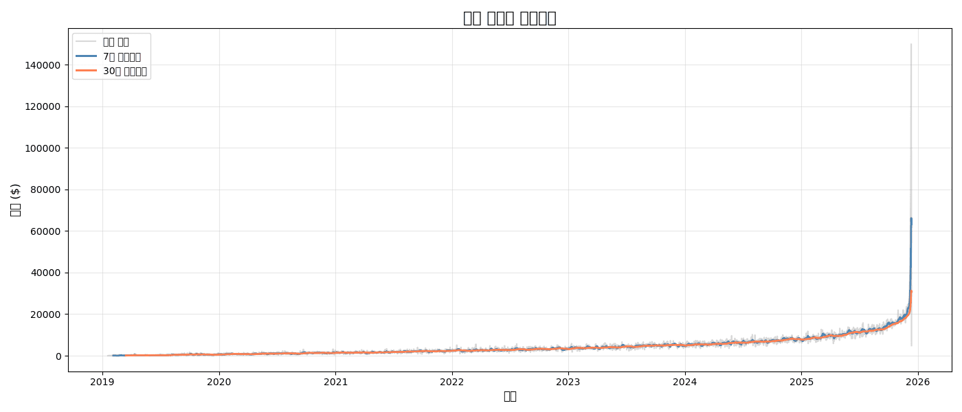
3. Moving Averages and Trends
Adding Moving Average
# Daily sales and moving averages
daily_sales = df.groupby(df['created_at'].dt.date)['sale_price'].sum()
ma_7 = daily_sales.rolling(window=7).mean()
ma_30 = daily_sales.rolling(window=30).mean()

plt.figure(figsize=(14, 6))

# Original data (light)
plt.plot(daily_sales.index, daily_sales.values,
         alpha=0.3, color='gray', label='Daily Sales')

# 7-day moving average
plt.plot(daily_sales.index, ma_7.values,
         linewidth=2, color='steelblue', label='7-Day Moving Average')

# 30-day moving average
plt.plot(daily_sales.index, ma_30.values,
         linewidth=2, color='coral', label='30-Day Moving Average')

plt.title('Daily Sales and Moving Averages', fontsize=16, fontweight='bold')
plt.xlabel('Date', fontsize=12)
plt.ylabel('Sales ($)', fontsize=12)
plt.legend()
plt.grid(True, alpha=0.3)
plt.tight_layout()
plt.show()
실행 결과
[Graph Saved: generated_plot_e2af8308d9_0.png]
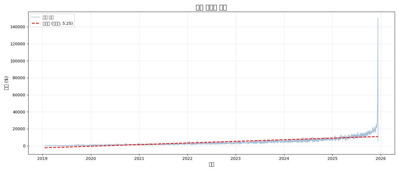
Trend Line (Linear Regression)
from scipy import stats
import numpy as np

# Linear regression
x = np.arange(len(daily_sales))
slope, intercept, r_value, p_value, std_err = stats.linregress(x, daily_sales.values)
trend_line = slope * x + intercept

plt.figure(figsize=(14, 6))

plt.plot(daily_sales.index, daily_sales.values,
         alpha=0.5, color='steelblue', label='Daily Sales')
plt.plot(daily_sales.index, trend_line,
         linewidth=2, color='red', linestyle='--', label=f'Trend (slope: {slope:.2f})')

plt.title('Sales Trend Analysis', fontsize=16, fontweight='bold')
plt.xlabel('Date', fontsize=12)
plt.ylabel('Sales ($)', fontsize=12)
plt.legend()
plt.grid(True, alpha=0.3)
plt.tight_layout()
plt.show()

print(f"📈 Daily Average Growth: ${slope:.2f}")
print(f"📊 R² = {r_value**2:.3f}")
실행 결과
[Graph Saved: generated_plot_5302302ced_0.png]
📈 Daily Average Growth: $5.25
📊 R² = 0.447
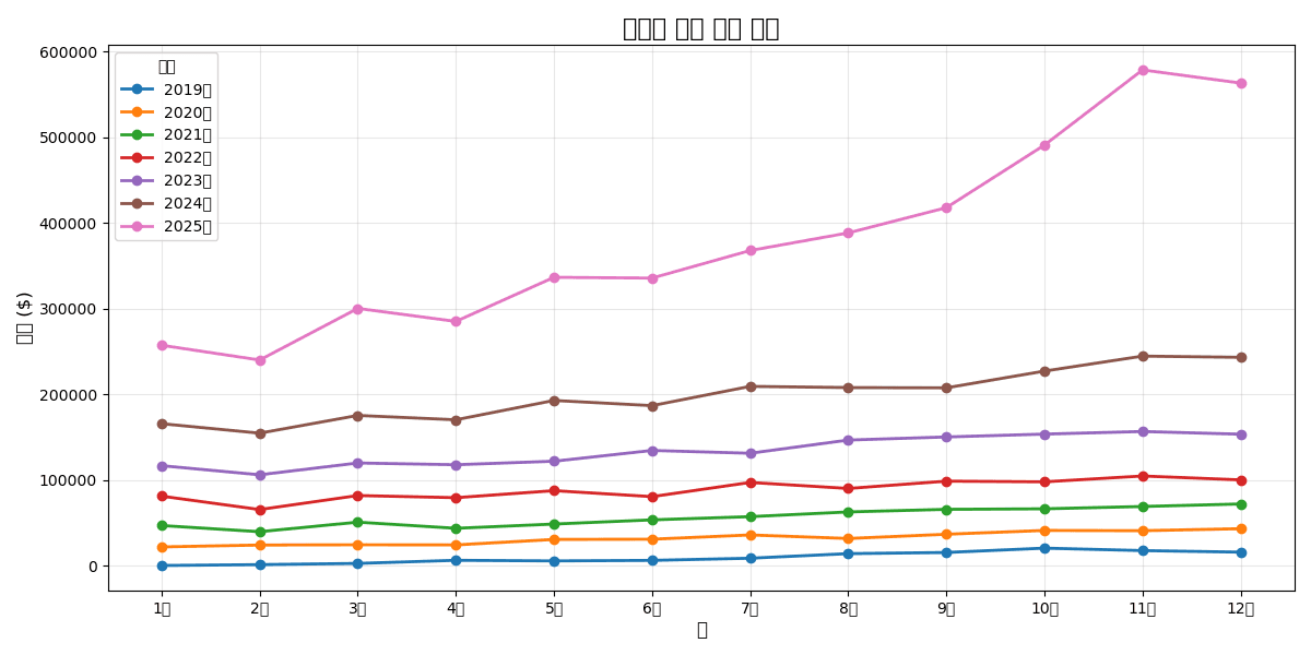
4. YoY/MoM Comparison Charts
Year-over-Year Same Month Comparison
# Monthly sales
monthly = df.groupby([
    df['created_at'].dt.year.rename('year'),
    df['created_at'].dt.month.rename('month')
])['sale_price'].sum().reset_index()

# Pivot
monthly_pivot = monthly.pivot(index='month', columns='year', values='sale_price')

# Comparison chart
plt.figure(figsize=(12, 6))

for year in monthly_pivot.columns:
    plt.plot(
        monthly_pivot.index,
        monthly_pivot[year],
        marker='o',
        linewidth=2,
        label=f'{year}'
    )

plt.title('Year-over-Year Monthly Sales Comparison', fontsize=16, fontweight='bold')
plt.xlabel('Month', fontsize=12)
plt.ylabel('Sales ($)', fontsize=12)
plt.xticks(range(1, 13), ['Jan', 'Feb', 'Mar', 'Apr', 'May', 'Jun',
                          'Jul', 'Aug', 'Sep', 'Oct', 'Nov', 'Dec'])
plt.legend(title='Year')
plt.grid(True, alpha=0.3)
plt.tight_layout()
plt.show()
실행 결과
[Graph Saved: generated_plot_a0e75c3b92_0.png]
5. Plotly Interactive Charts
Basic Line Chart
import plotly.express as px

# Monthly sales
monthly_sales = df.groupby(df['created_at'].dt.to_period('M'))['sale_price'].sum()
monthly_df = pd.DataFrame({
    'month': monthly_sales.index.astype(str),
    'sales': monthly_sales.values
})

fig = px.line(
    monthly_df,
    x='month',
    y='sales',
    title='Monthly Sales Trend',
    markers=True
)

fig.update_layout(
    xaxis_title='Month',
    yaxis_title='Sales ($)',
    hovermode='x unified'
)

fig.show()
Multiple Time Series + Range Selector
import plotly.graph_objects as go
fig = go.Figure()
# Add multiple categories
for cat in top_5:
cat_data = category_monthly[cat]
fig.add_trace(go.Scatter(
x=cat_data.index.astype(str),
y=cat_data.values,
mode='lines+markers',
name=cat,
hovertemplate='%{y:$,.0f}<extra></extra>'
))
fig.update_layout(
title='Monthly Sales by Category (Interactive)',
xaxis_title='Month',
yaxis_title='Sales ($)',
hovermode='x unified',
legend_title='Category',
# Range selector
xaxis=dict(
rangeselector=dict(
buttons=list([
dict(count=3, label='3 Months', step='month', stepmode='backward'),
dict(count=6, label='6 Months', step='month', stepmode='backward'),
dict(step='all', label='All')
])
),
rangeslider=dict(visible=True)
)
)
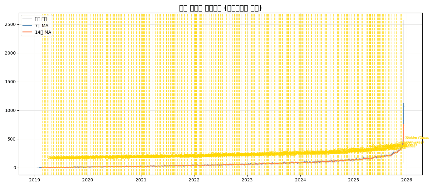
fig.show()Quiz 1: Moving Average Analysis
Problem
For daily order count:
- Calculate 7-day and 14-day moving averages
- Display original data lightly, moving averages boldly
- Mark golden crosses (7-day MA > 14-day MA crossover points)
View Answer
# Daily order count
daily_orders = df.groupby(df['created_at'].dt.date).size()
ma_7 = daily_orders.rolling(7).mean()
ma_14 = daily_orders.rolling(14).mean()

# Find golden crosses
golden_cross = (ma_7 > ma_14) & (ma_7.shift(1) <= ma_14.shift(1))
cross_dates = daily_orders[golden_cross].index

plt.figure(figsize=(14, 6))

# Original (light)
plt.plot(daily_orders.index, daily_orders.values,
         alpha=0.2, color='gray', label='Daily Orders')

# Moving averages
plt.plot(daily_orders.index, ma_7.values,
         linewidth=2, color='steelblue', label='7-Day MA')
plt.plot(daily_orders.index, ma_14.values,
         linewidth=2, color='coral', label='14-Day MA')

# Mark golden crosses
for date in cross_dates:
    plt.axvline(date, color='gold', linestyle='--', alpha=0.7)
    plt.annotate('Golden Cross', xy=(date, daily_orders[date]),
                xytext=(10, 20), textcoords='offset points',
                fontsize=8, color='gold')

plt.title('Daily Orders with Moving Averages (Golden Cross Marked)', fontsize=16, fontweight='bold')
plt.legend()
plt.grid(True, alpha=0.3)
plt.tight_layout()
plt.show()
실행 결과
[Graph Saved: generated_plot_772a0ee4c3_0.png]
Summary
plt.plot() Key Parameters
| Parameter | Description | Example |
|---|---|---|
linewidth | Line thickness | 2 |
linestyle | Line style | '-', '--', ':' |
marker | Marker type | 'o', 's', '^' |
color | Color | 'steelblue', '#1f77b4' |
alpha | Transparency | 0.5 |
label | Legend label | 'Sales' |
Time Series Chart Selection Guide
| Situation | Recommended Chart |
|---|---|
| Single time series | Basic line chart |
| Multiple comparison | Overlapping lines or subplots |
| Noise removal | Add moving average |
| Trend confirmation | Add regression line |
| Interactive | Plotly |
Next Steps
You’ve mastered time series charts! Next, learn about histograms, box plots, and other distribution analysis charts in Distribution Visualization.
Last updated on