시계열 차트
중급
학습 목표
이 레시피를 완료하면 다음을 할 수 있습니다:
- 기본 라인 차트 생성
- 다중 시계열 비교
- 이동 평균과 트렌드 표시
- Plotly로 인터랙티브 차트 만들기
0. 사전 준비 (Setup)
데이터 실습을 위해 CSV 파일을 로드합니다.
import pandas as pd
import matplotlib.pyplot as plt

# Load Data
orders = pd.read_csv('src_orders.csv', parse_dates=['created_at'])
items = pd.read_csv('src_order_items.csv')
products = pd.read_csv('src_products.csv')

# Merge for Analysis
df = orders.merge(items, on='order_id').merge(products, on='product_id')

# Ensure datetime conversion
df['created_at'] = pd.to_datetime(df['created_at'], format='mixed')
1. 기본 라인 차트
Matplotlib 기본
import pandas as pd
import matplotlib.pyplot as plt

# 일별 매출 데이터
daily_sales = df.groupby(df['created_at'].dt.date)['sale_price'].sum()

# 기본 라인 차트
plt.figure(figsize=(14, 6))
plt.plot(daily_sales.index, daily_sales.values, linewidth=2, color='steelblue')
plt.title('Daily Sales Trend', fontsize=16, fontweight='bold')
plt.xlabel('Date', fontsize=12)
plt.ylabel('Sales ($)', fontsize=12)
plt.grid(True, alpha=0.3)
plt.xticks(rotation=45)
plt.tight_layout()
plt.show()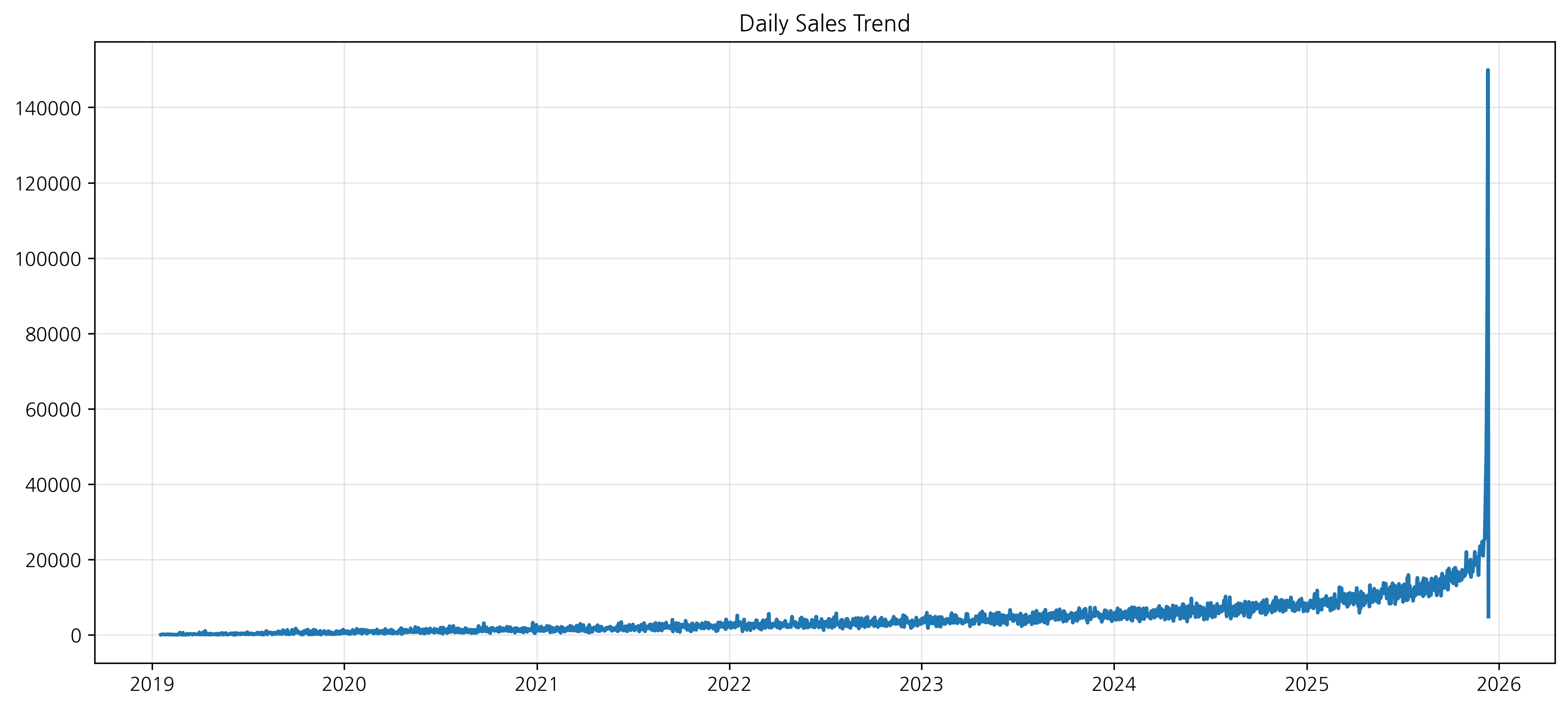
2. 스타일링 옵션
선 스타일, 마커, 색상 등을 변경하여 가독성을 높일 수 있습니다.
plt.figure(figsize=(14, 6))

plt.plot(daily_sales.index, daily_sales.values,
         color='green',
         linestyle='--',
         marker='o',
         markersize=8,
         label='Daily Sales')

plt.title('Daily Sales Trend (Styled)', fontsize=16, fontweight='bold')
plt.xlabel('Date', fontsize=12)
plt.ylabel('Sales ($)', fontsize=12)
plt.grid(True, alpha=0.3, linestyle='-.')
plt.legend()

plt.show()
스타일링 옵션
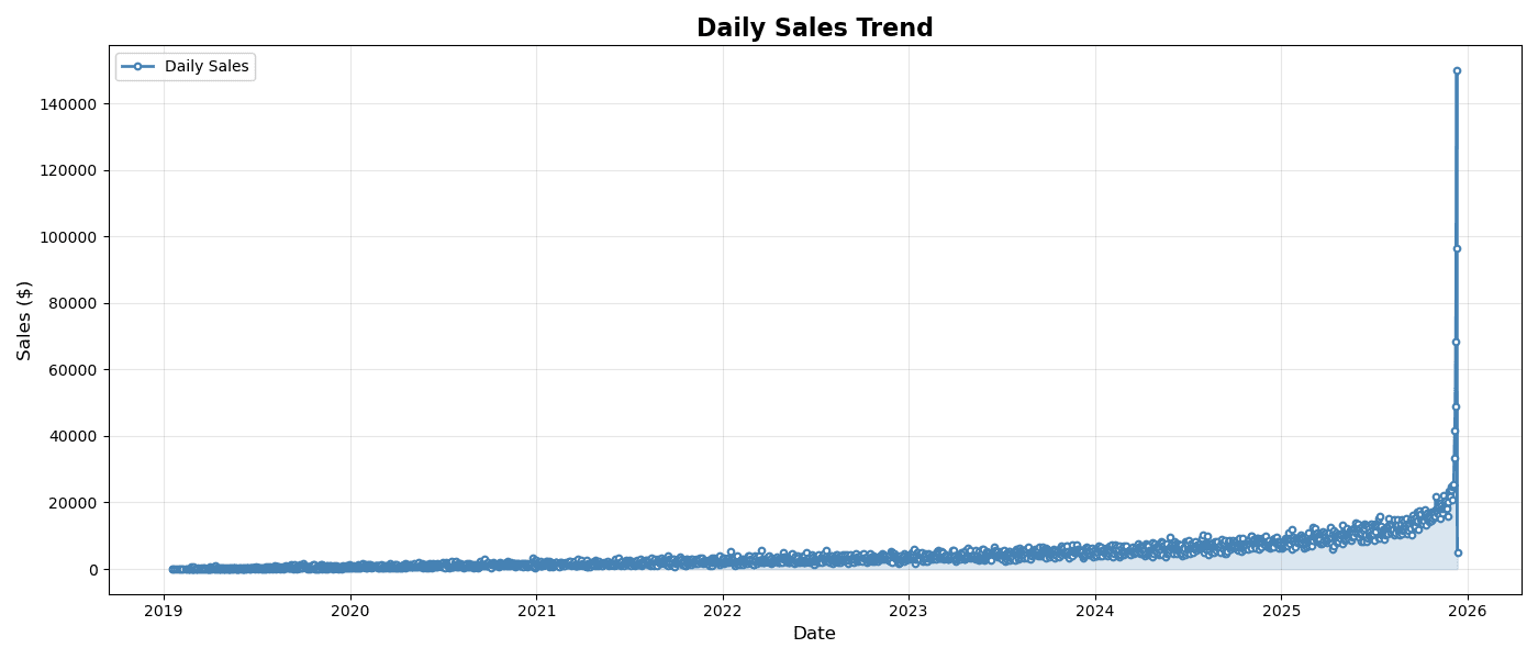
plt.figure(figsize=(14, 6))

plt.plot(
    daily_sales.index,
    daily_sales.values,
    linewidth=2,
    color='steelblue',
    marker='o',           # 마커 추가
    markersize=4,
    markerfacecolor='white',
    markeredgewidth=1.5,
    label='Daily Sales'
)

plt.fill_between(
    daily_sales.index,
    daily_sales.values,
    alpha=0.2,           # 영역 채우기
    color='steelblue'
)

plt.title('Daily Sales Trend', fontsize=16, fontweight='bold')
plt.xlabel('Date', fontsize=12)
plt.ylabel('Sales ($)', fontsize=12)
plt.legend()
plt.grid(True, alpha=0.3)
plt.tight_layout()
plt.show()
실행 결과
[Graph Saved: generated_plot_38d08c04e4_0.png]
2. 다중 시계열 비교
여러 라인 겹치기
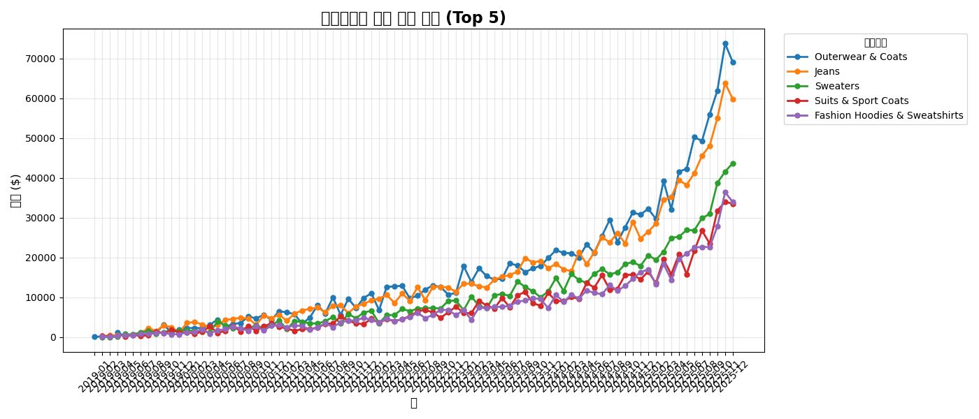
# 카테고리별 월별 매출
category_monthly = df.groupby([
    df['created_at'].dt.to_period('M'),
    'category'
])['sale_price'].sum().unstack()

# 상위 5개 카테고리
top_5 = df.groupby('category')['sale_price'].sum().nlargest(5).index
category_monthly = category_monthly[top_5]

# 다중 라인 차트
plt.figure(figsize=(14, 6))

for col in category_monthly.columns:
    plt.plot(
        category_monthly.index.astype(str),
        category_monthly[col],
        marker='o',
        linewidth=2,
        markersize=5,
        label=col
    )

plt.title('카테고리별 월별 매출 추이 (Top 5)', fontsize=16, fontweight='bold')
plt.xlabel('월', fontsize=12)
plt.ylabel('매출 ($)', fontsize=12)
plt.legend(title='카테고리', bbox_to_anchor=(1.02, 1), loc='upper left')
plt.xticks(rotation=45)
plt.grid(True, alpha=0.3)
plt.tight_layout()
plt.show()
실행 결과
[Graph Saved: generated_plot_7d30c61072_0.png]
서브플롯으로 분리
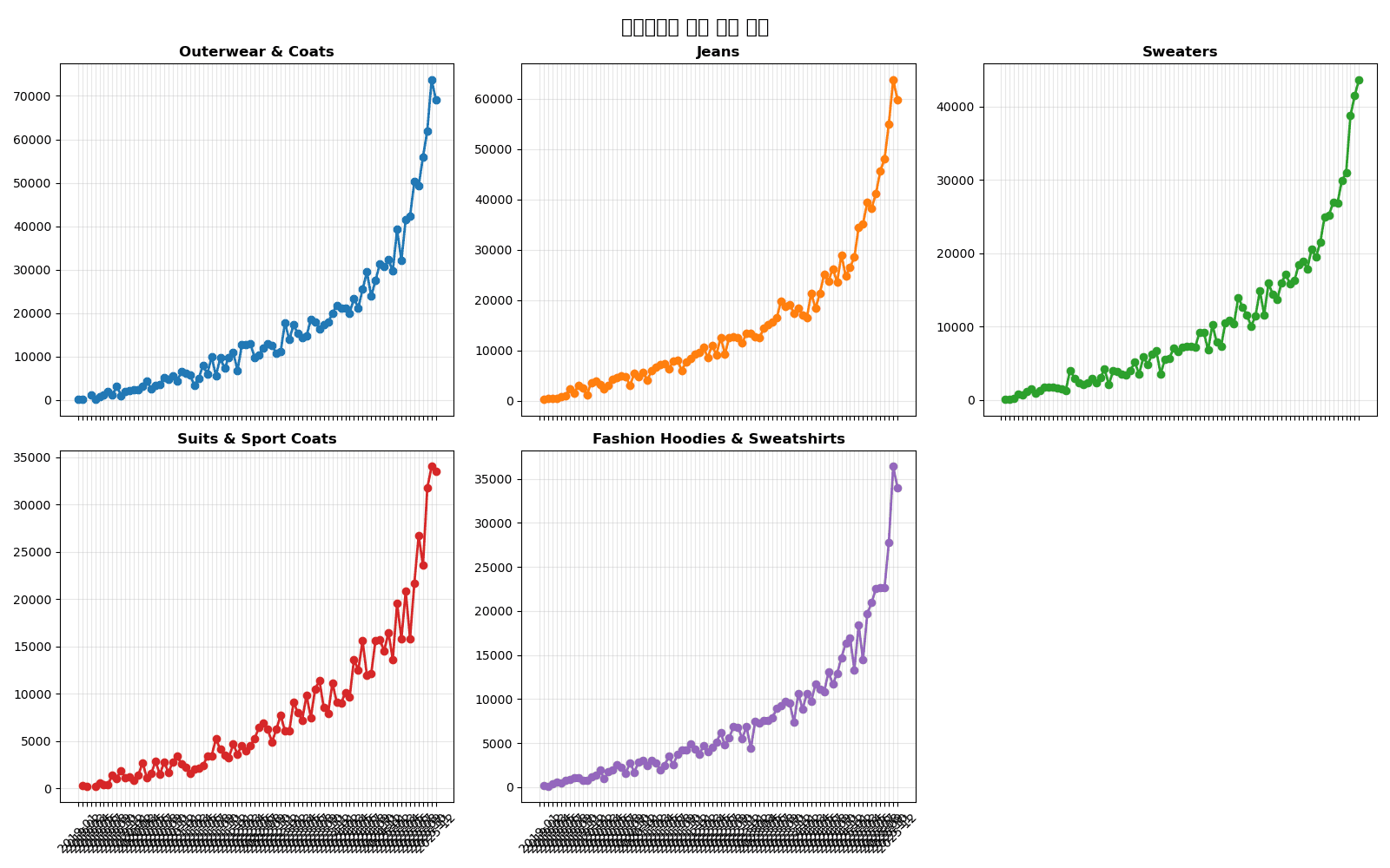
fig, axes = plt.subplots(2, 3, figsize=(16, 10), sharex=True)
axes = axes.flatten()

for i, col in enumerate(top_5):
    ax = axes[i]
    ax.plot(category_monthly.index.astype(str), category_monthly[col],
            marker='o', linewidth=2, color=f'C{i}')
    ax.set_title(col, fontsize=12, fontweight='bold')
    ax.grid(True, alpha=0.3)
    ax.tick_params(axis='x', rotation=45)

# 빈 서브플롯 숨기기
for j in range(len(top_5), len(axes)):
    axes[j].set_visible(False)

fig.suptitle('카테고리별 월별 매출 추이', fontsize=16, fontweight='bold')
plt.tight_layout()
plt.show()
실행 결과
[Graph Saved: generated_plot_ac6a666484_0.png]
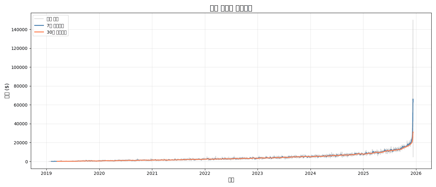
3. 이동 평균과 트렌드
이동 평균 추가
# 일별 매출과 이동 평균
daily_sales = df.groupby(df['created_at'].dt.date)['sale_price'].sum()
ma_7 = daily_sales.rolling(window=7).mean()
ma_30 = daily_sales.rolling(window=30).mean()

plt.figure(figsize=(14, 6))

# 원본 데이터 (옅게)
plt.plot(daily_sales.index, daily_sales.values,
         alpha=0.3, color='gray', label='일별 매출')

# 7일 이동평균
plt.plot(daily_sales.index, ma_7.values,
         linewidth=2, color='steelblue', label='7일 이동평균')

# 30일 이동평균
plt.plot(daily_sales.index, ma_30.values,
         linewidth=2, color='coral', label='30일 이동평균')

plt.title('일별 매출과 이동평균', fontsize=16, fontweight='bold')
plt.xlabel('날짜', fontsize=12)
plt.ylabel('매출 ($)', fontsize=12)
plt.legend()
plt.grid(True, alpha=0.3)
plt.tight_layout()
plt.show()
실행 결과
[Graph Saved: generated_plot_e2af8308d9_0.png]
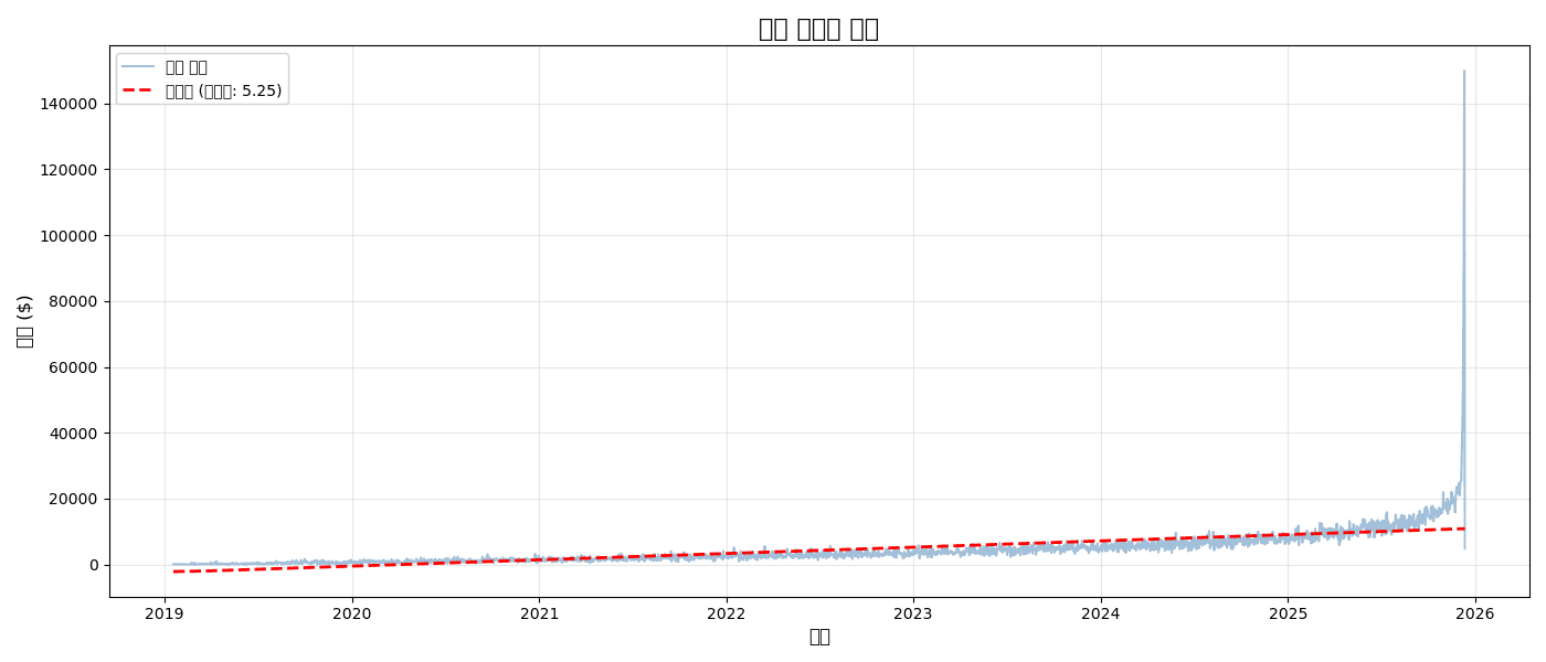
트렌드 라인 (선형 회귀)
from scipy import stats
import numpy as np

# 선형 회귀
x = np.arange(len(daily_sales))
slope, intercept, r_value, p_value, std_err = stats.linregress(x, daily_sales.values)
trend_line = slope * x + intercept

plt.figure(figsize=(14, 6))

plt.plot(daily_sales.index, daily_sales.values,
         alpha=0.5, color='steelblue', label='일별 매출')
plt.plot(daily_sales.index, trend_line,
         linewidth=2, color='red', linestyle='--', label=f'트렌드 (기울기: {slope:.2f})')

plt.title('매출 트렌드 분석', fontsize=16, fontweight='bold')
plt.xlabel('날짜', fontsize=12)
plt.ylabel('매출 ($)', fontsize=12)
plt.legend()
plt.grid(True, alpha=0.3)
plt.tight_layout()
plt.show()

print(f"📈 일평균 성장: ${slope:.2f}")
print(f"📊 R² = {r_value**2:.3f}")
실행 결과
[Graph Saved: generated_plot_5302302ced_0.png]
📈 일평균 성장: $5.25
📊 R² = 0.447
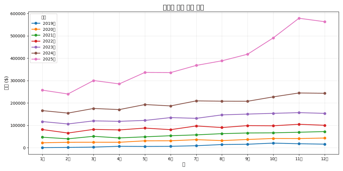
4. YoY/MoM 비교 차트
전년 동월 비교
# 월별 매출
monthly = df.groupby([
    df['created_at'].dt.year.rename('year'),
    df['created_at'].dt.month.rename('month')
])['sale_price'].sum().reset_index()

# 피벗
monthly_pivot = monthly.pivot(index='month', columns='year', values='sale_price')

# 비교 차트
plt.figure(figsize=(12, 6))

for year in monthly_pivot.columns:
    plt.plot(
        monthly_pivot.index,
        monthly_pivot[year],
        marker='o',
        linewidth=2,
        label=f'{year}년'
    )

plt.title('연도별 월간 매출 비교', fontsize=16, fontweight='bold')
plt.xlabel('월', fontsize=12)
plt.ylabel('매출 ($)', fontsize=12)
plt.xticks(range(1, 13), ['1월', '2월', '3월', '4월', '5월', '6월',
                          '7월', '8월', '9월', '10월', '11월', '12월'])
plt.legend(title='연도')
plt.grid(True, alpha=0.3)
plt.tight_layout()
plt.show()
실행 결과
[Graph Saved: generated_plot_a0e75c3b92_0.png]
5. Plotly 인터랙티브 차트
기본 라인 차트
import plotly.express as px

# 월별 매출
monthly_sales = df.groupby(df['created_at'].dt.to_period('M'))['sale_price'].sum()
monthly_df = pd.DataFrame({
    'month': monthly_sales.index.astype(str),
    'sales': monthly_sales.values
})

fig = px.line(
    monthly_df,
    x='month',
    y='sales',
    title='월별 매출 추이',
    markers=True
)

fig.update_layout(
    xaxis_title='월',
    yaxis_title='매출 ($)',
    hovermode='x unified'
)

fig.show()
다중 시계열 + 범위 선택기
import plotly.graph_objects as go
fig = go.Figure()
# 여러 카테고리 추가
for cat in top_5:
cat_data = category_monthly[cat]
fig.add_trace(go.Scatter(
x=cat_data.index.astype(str),
y=cat_data.values,
mode='lines+markers',
name=cat,
hovertemplate='%{y:$,.0f}<extra></extra>'
))
fig.update_layout(
title='카테고리별 월별 매출 (인터랙티브)',
xaxis_title='월',
yaxis_title='매출 ($)',
hovermode='x unified',
legend_title='카테고리',
# 범위 선택기
xaxis=dict(
rangeselector=dict(
buttons=list([
dict(count=3, label='3개월', step='month', stepmode='backward'),
dict(count=6, label='6개월', step='month', stepmode='backward'),
dict(step='all', label='전체')
])
),
rangeslider=dict(visible=True)
)
)
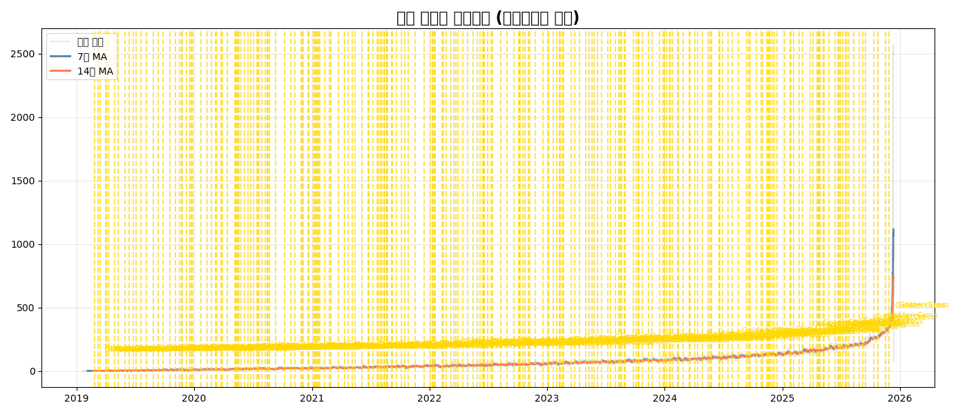
fig.show()퀴즈 1: 이동평균 분석
문제
일별 주문 건수에 대해:
- 7일 이동평균과 14일 이동평균 계산
- 원본 데이터는 옅게, 이동평균은 진하게 표시
- 골든크로스 (7일 MA > 14일 MA 전환점) 표시
정답 보기
# 일별 주문 건수
daily_orders = df.groupby(df['created_at'].dt.date).size()
ma_7 = daily_orders.rolling(7).mean()
ma_14 = daily_orders.rolling(14).mean()

# 골든크로스 찾기
golden_cross = (ma_7 > ma_14) & (ma_7.shift(1) <= ma_14.shift(1))
cross_dates = daily_orders[golden_cross].index

plt.figure(figsize=(14, 6))

# 원본 (옅게)
plt.plot(daily_orders.index, daily_orders.values,
         alpha=0.2, color='gray', label='일별 주문')

# 이동평균
plt.plot(daily_orders.index, ma_7.values,
         linewidth=2, color='steelblue', label='7일 MA')
plt.plot(daily_orders.index, ma_14.values,
         linewidth=2, color='coral', label='14일 MA')

# 골든크로스 표시
for date in cross_dates:
    plt.axvline(date, color='gold', linestyle='--', alpha=0.7)
    plt.annotate('Golden Cross', xy=(date, daily_orders[date]),
                xytext=(10, 20), textcoords='offset points',
                fontsize=8, color='gold')

plt.title('일별 주문과 이동평균 (골든크로스 표시)', fontsize=16, fontweight='bold')
plt.legend()
plt.grid(True, alpha=0.3)
plt.tight_layout()
plt.show()
실행 결과
[Graph Saved: generated_plot_772a0ee4c3_0.png]
정리
plt.plot() 주요 파라미터
| 파라미터 | 설명 | 예시 |
|---|---|---|
linewidth | 선 두께 | 2 |
linestyle | 선 스타일 | '-', '--', ':' |
marker | 마커 종류 | 'o', 's', '^' |
color | 색상 | 'steelblue', '#1f77b4' |
alpha | 투명도 | 0.5 |
label | 범례 라벨 | '매출' |
시계열 차트 선택 가이드
| 상황 | 추천 차트 |
|---|---|
| 단일 시계열 | 기본 라인 차트 |
| 다중 비교 | 겹친 라인 or 서브플롯 |
| 노이즈 제거 | 이동평균 추가 |
| 트렌드 확인 | 회귀선 추가 |
| 인터랙티브 | Plotly |
다음 단계
시계열 차트를 마스터했습니다! 다음으로 분포 시각화에서 히스토그램, 박스플롯 등 분포 분석 차트를 배워보세요.
Last updated on