분포 시각화
초급중급
학습 목표
이 레시피를 완료하면 다음을 할 수 있습니다:
- 히스토그램으로 데이터 분포 파악
- 박스플롯으로 이상치 탐지
- 바이올린 플롯으로 분포 비교
- KDE 플롯으로 밀도 추정
0. 사전 준비 (Setup)
데이터 실습을 위해 CSV 파일을 로드합니다.
import pandas as pd
import seaborn as sns
import matplotlib.pyplot as plt

# Load Data
# Load Data
orders = pd.read_csv('src_orders.csv', parse_dates=['created_at'])
items = pd.read_csv('src_order_items.csv')
users = pd.read_csv('src_users.csv')
df = orders.merge(items, on='order_id').merge(users, on='user_id')
1. 히스토그램
이론
히스토그램은 연속형 데이터를 구간(bin)으로 나누어 빈도를 막대로 표현합니다. 데이터의 분포 형태(정규, 왜도, 이봉 등)를 파악하는 데 유용합니다.
기본 히스토그램
import pandas as pd
import matplotlib.pyplot as plt
import seaborn as sns

# 기본 히스토그램
plt.figure(figsize=(12, 5))

plt.subplot(1, 2, 1)
plt.hist(df['sale_price'], bins=30, color='steelblue', edgecolor='white', alpha=0.7)
plt.title('Sale Price Distribution (Matplotlib)', fontsize=14, fontweight='bold')
plt.xlabel('Sale Price ($)')
plt.ylabel('Frequency')

plt.subplot(1, 2, 2)
sns.histplot(df['sale_price'], bins=30, kde=True, color='coral')
plt.title('Sale Price Distribution (Seaborn + KDE)', fontsize=14, fontweight='bold')
plt.xlabel('Sale Price ($)')

plt.tight_layout()
plt.show()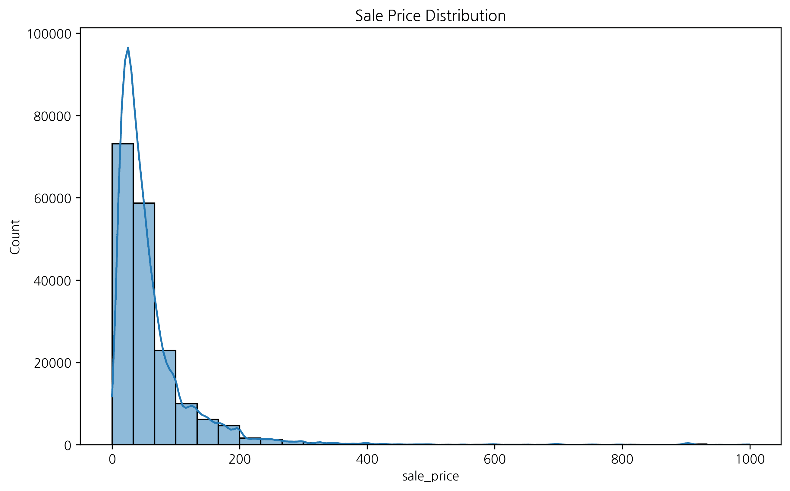
2. 구간(Bin) 개수 설정
bins 파라미터로 히스토그램의 막대 개수를 조절할 수 있습니다. 구간 설정에 따라 데이터 해석이 달라질 수 있습니다.
fig, axes = plt.subplots(1, 3, figsize=(15, 5))

sns.histplot(df['sale_price'], bins=10, ax=axes[0], color='skyblue')
axes[0].set_title('Bins = 10')

sns.histplot(df['sale_price'], bins=30, ax=axes[1], color='orange')
axes[1].set_title('Bins = 30')

sns.histplot(df['sale_price'], bins=50, ax=axes[2], color='green')
axes[2].set_title('Bins = 50')

plt.tight_layout()
plt.show()
ℹ️
구간이 너무 적으면 데이터의 특징이 뭉개지고, 너무 많으면 노이즈가 심해질 수 있습니다. 적절한 bins 설정이 중요합니다.
3. 그룹별 히스토그램 (Grouped Histogram)
범주형 변수에 따라 데이터 분포가 어떻게 다른지 비교할 수 있습니다. 예를 들어, 성별에 따른 판매 가격 분포를 확인해 봅니다.
plt.figure(figsize=(10, 6))
sns.histplot(data=df, x='sale_price', hue='gender', kde=True, element='step')
plt.title('Sale Price Distribution by Gender')
plt.xlabel('Sale Price')
plt.ylabel('Count')
plt.legend(title='Gender')
plt.show()
4. 박스 플롯 (Box Plot)
데이터의 분포와 이상치(Outlier)를 한눈에 파악하기 좋습니다.
plt.figure(figsize=(12, 6))
sns.boxplot(x='category', y='sale_price', data=df)
plt.xticks(rotation=45)
plt.title('Price Distribution by Category')
plt.show()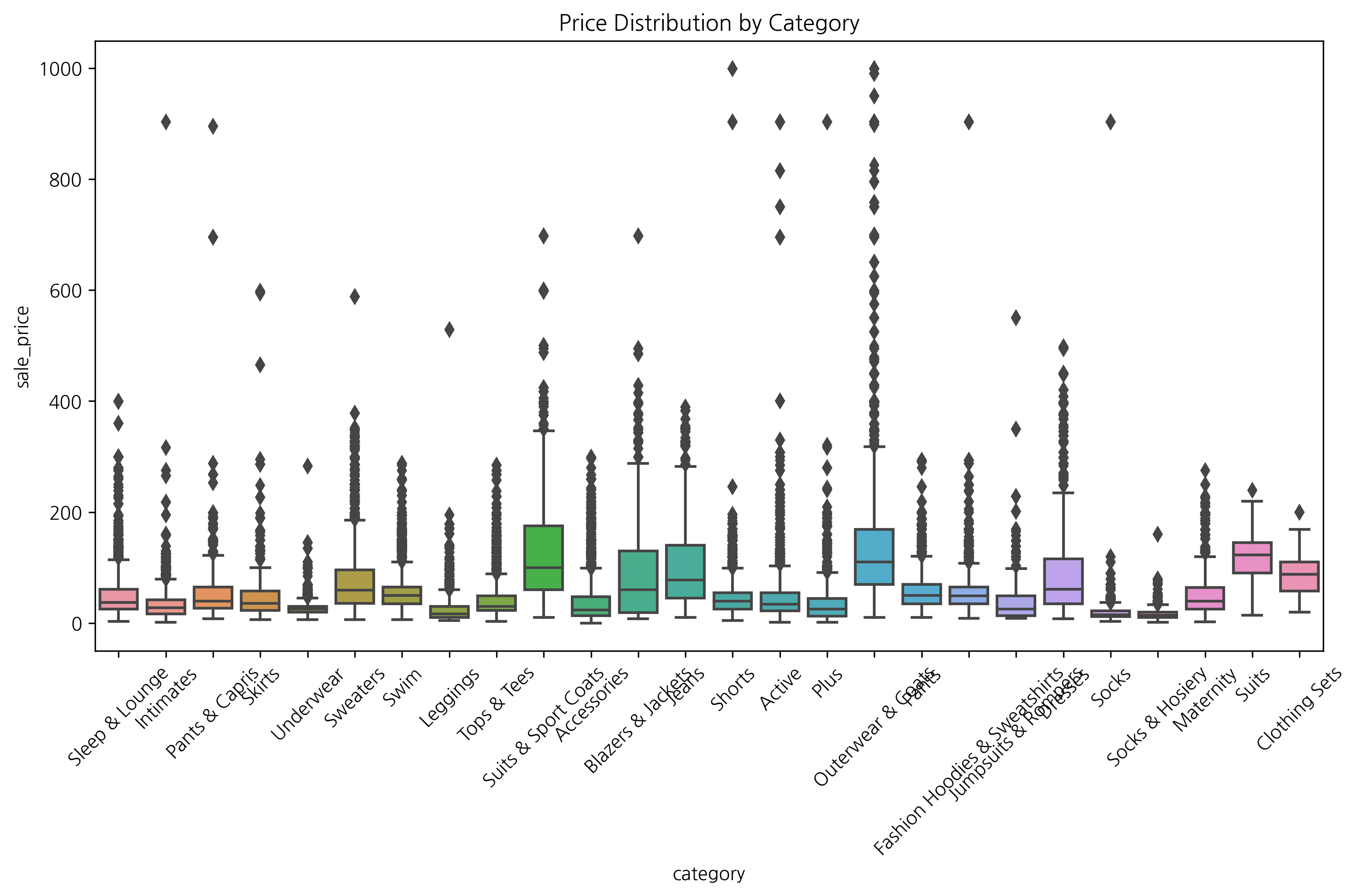
2. 박스플롯
이론
박스플롯은 데이터의 5가지 요약 통계량(최소, Q1, 중앙값, Q3, 최대)과 이상치를 시각화합니다.
박스플롯 구성:
- 박스: Q1 ~ Q3 (IQR)
- 중앙선: 중앙값 (median)
- 수염: Q1 - 1.5×IQR ~ Q3 + 1.5×IQR
- 점: 이상치 (outliers)
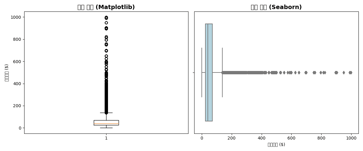
기본 박스플롯
plt.figure(figsize=(12, 5))

# Matplotlib
plt.subplot(1, 2, 1)
plt.boxplot(df['sale_price'].dropna())
plt.title('가격 분포 (Matplotlib)', fontsize=14, fontweight='bold')
plt.ylabel('판매가격 ($)')

# Seaborn (수평)
plt.subplot(1, 2, 2)
sns.boxplot(x=df['sale_price'], color='lightblue')
plt.title('가격 분포 (Seaborn)', fontsize=14, fontweight='bold')
plt.xlabel('판매가격 ($)')

plt.tight_layout()
plt.show()
실행 결과
[Graph Saved: generated_plot_1d8420747f_0.png]
그룹별 박스플롯
plt.figure(figsize=(14, 6))

# 부서별 가격 분포
sns.boxplot(
    data=df,
    x='department',
    y='sale_price',
    palette='Set2',
    showfliers=True  # 이상치 표시
)

plt.title('부서별 판매가격 분포', fontsize=14, fontweight='bold')
plt.xlabel('부서')
plt.ylabel('판매가격 ($)')
plt.tight_layout()
plt.show()

# 통계 요약
print("📊 부서별 통계:")
print(df.groupby('department')['sale_price'].describe().round(2))
실행 결과
Error: Could not interpret input 'department'
그룹화된 박스플롯
plt.figure(figsize=(14, 6))

# 부서 × 성별
sns.boxplot(
    data=df,
    x='department',
    y='sale_price',
    hue='gender',
    palette=['lightcoral', 'lightblue']
)

plt.title('부서/성별 판매가격 분포', fontsize=14, fontweight='bold')
plt.xlabel('부서')
plt.ylabel('판매가격 ($)')
plt.legend(title='성별')
plt.tight_layout()
plt.show()
실행 결과
Error: Could not interpret input 'department'
3. 바이올린 플롯
이론
바이올린 플롯은 박스플롯 + KDE(커널 밀도 추정)의 결합입니다. 분포의 형태를 더 자세히 볼 수 있습니다.
기본 바이올린 플롯
plt.figure(figsize=(14, 6))

sns.violinplot(
    data=df,
    x='department',
    y='sale_price',
    palette='Set2',
    inner='box'  # 내부에 박스플롯
)

plt.title('부서별 가격 분포 (바이올린 플롯)', fontsize=14, fontweight='bold')
plt.xlabel('부서')
plt.ylabel('판매가격 ($)')
plt.tight_layout()
plt.show()
실행 결과
Error: Could not interpret input 'department'
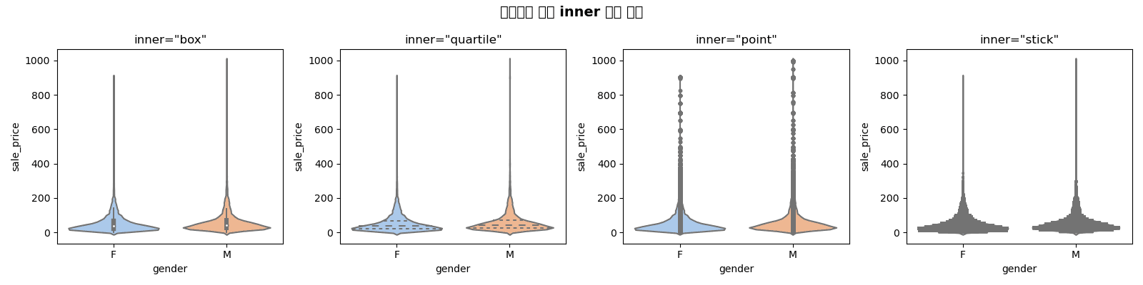
inner 옵션
fig, axes = plt.subplots(1, 4, figsize=(16, 4))
inner_options = ['box', 'quartile', 'point', 'stick']

for ax, inner in zip(axes, inner_options):
    sns.violinplot(
        data=df,
        x='gender',
        y='sale_price',
        inner=inner,
        ax=ax,
        palette='pastel'
    )
    ax.set_title(f'inner="{inner}"', fontsize=12)

plt.suptitle('바이올린 플롯 inner 옵션 비교', fontsize=14, fontweight='bold')
plt.tight_layout()
plt.show()
실행 결과
[Graph Saved: generated_plot_775a688b4b_0.png]
스플릿 바이올린
plt.figure(figsize=(14, 6))

sns.violinplot(
    data=df,
    x='department',
    y='sale_price',
    hue='gender',
    split=True,  # 반쪽씩 표시
    palette=['lightcoral', 'lightblue'],
    inner='quartile'
)

plt.title('부서/성별 가격 분포 (스플릿 바이올린)', fontsize=14, fontweight='bold')
plt.xlabel('부서')
plt.ylabel('판매가격 ($)')
plt.legend(title='성별')
plt.tight_layout()
plt.show()
실행 결과
Error: Could not interpret input 'department'
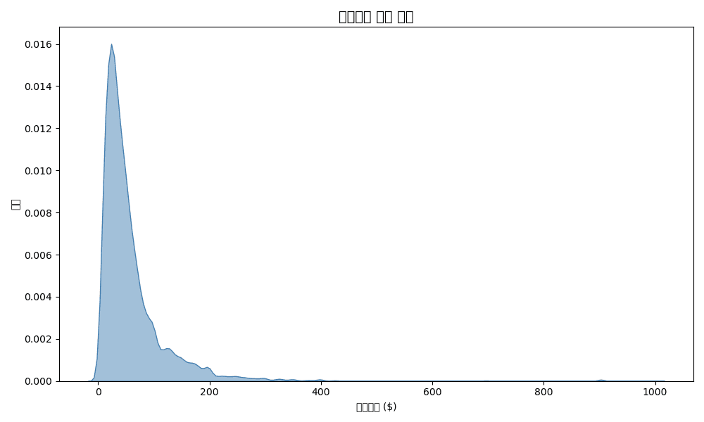
4. KDE 플롯 (커널 밀도 추정)
이론
KDE는 히스토그램을 부드럽게 만든 연속적인 확률 밀도 함수입니다. 분포 형태를 비교할 때 유용합니다.
기본 KDE
plt.figure(figsize=(10, 6))

# 단일 KDE
sns.kdeplot(df['sale_price'], fill=True, color='steelblue', alpha=0.5)

plt.title('판매가격 밀도 분포', fontsize=14, fontweight='bold')
plt.xlabel('판매가격 ($)')
plt.ylabel('밀도')
plt.tight_layout()
plt.show()
실행 결과
[Graph Saved: generated_plot_be63fa9bdc_0.png]
그룹별 KDE 비교
plt.figure(figsize=(12, 6))

# 부서별 KDE
for dept in df['department'].unique():
    dept_data = df[df['department'] == dept]['sale_price']
    sns.kdeplot(dept_data, label=dept, fill=True, alpha=0.3)

plt.title('부서별 가격 분포 비교', fontsize=14, fontweight='bold')
plt.xlabel('판매가격 ($)')
plt.ylabel('밀도')
plt.legend(title='부서')
plt.tight_layout()
plt.show()
실행 결과
Error: 'department'
2D KDE (조인트 분포)
plt.figure(figsize=(10, 8))

sns.kdeplot(
    data=df,
    x='retail_price',
    y='sale_price',
    cmap='Blues',
    fill=True,
    levels=10,
    thresh=0.05
)

plt.title('정가 vs 판매가 조인트 분포', fontsize=14, fontweight='bold')
plt.xlabel('정가 ($)')
plt.ylabel('판매가 ($)')
plt.tight_layout()
plt.show()
실행 결과
Error: Could not interpret value `retail_price` for parameter `x`
5. 종합 분포 플롯
Seaborn JointPlot
# 산점도 + 히스토그램
g = sns.jointplot(
    data=df,
    x='retail_price',
    y='sale_price',
    kind='scatter',
    height=8,
    alpha=0.5
)
g.fig.suptitle('정가 vs 판매가 관계', fontsize=14, fontweight='bold', y=1.02)
plt.show()
실행 결과
Error: Could not interpret value `retail_price` for parameter `x`
PairPlot (다변량 분포)
# 수치형 변수들의 관계
numeric_cols = ['retail_price', 'cost', 'sale_price', 'num_of_item']
sns.pairplot(
    df[numeric_cols].sample(1000),  # 샘플링
    diag_kind='kde',
    plot_kws={'alpha': 0.5}
)
plt.suptitle('수치형 변수 관계', fontsize=14, fontweight='bold', y=1.02)
plt.show()
실행 결과
Error: "['retail_price', 'cost'] not in index"
퀴즈 1: 분포 비교
문제
부서별 판매가격 분포를 다음 3가지 방법으로 비교하세요:
- 히스토그램 (겹치기, 밀도 정규화)
- 박스플롯
- 바이올린 플롯
정답 보기
fig, axes = plt.subplots(1, 3, figsize=(18, 5))

# 1. 히스토그램
sns.histplot(
    data=df,
    x='sale_price',
    hue='department',
    stat='density',
    common_norm=False,
    alpha=0.5,
    ax=axes[0]
)
axes[0].set_title('히스토그램', fontsize=12, fontweight='bold')
axes[0].set_xlabel('판매가격 ($)')

# 2. 박스플롯
sns.boxplot(
    data=df,
    x='department',
    y='sale_price',
    palette='Set2',
    ax=axes[1]
)
axes[1].set_title('박스플롯', fontsize=12, fontweight='bold')
axes[1].tick_params(axis='x', rotation=45)

# 3. 바이올린 플롯
sns.violinplot(
    data=df,
    x='department',
    y='sale_price',
    palette='Set2',
    inner='quartile',
    ax=axes[2]
)
axes[2].set_title('바이올린 플롯', fontsize=12, fontweight='bold')
axes[2].tick_params(axis='x', rotation=45)

plt.suptitle('부서별 판매가격 분포 비교', fontsize=14, fontweight='bold')
plt.tight_layout()
plt.show()
실행 결과
Error: Could not interpret value `department` for parameter `hue`
퀴즈 2: 이상치 분석
문제
카테고리별 판매가격의 이상치를 분석하세요:
- 상위 10개 카테고리의 박스플롯 생성
- 각 카테고리의 이상치 개수 계산
- 이상치가 가장 많은 카테고리 3개 출력
정답 보기
# 상위 10개 카테고리
top_10_cat = df.groupby('category')['sale_price'].sum().nlargest(10).index
df_top10 = df[df['category'].isin(top_10_cat)]

# 박스플롯
plt.figure(figsize=(14, 6))
sns.boxplot(
    data=df_top10,
    x='category',
    y='sale_price',
    palette='Set3',
    order=top_10_cat
)
plt.title('상위 10개 카테고리 가격 분포', fontsize=14, fontweight='bold')
plt.xticks(rotation=45, ha='right')
plt.tight_layout()
plt.show()

# 이상치 개수 계산 (IQR 방법)
def count_outliers(group):
    Q1 = group.quantile(0.25)
    Q3 = group.quantile(0.75)
    IQR = Q3 - Q1
    lower = Q1 - 1.5 * IQR
    upper = Q3 + 1.5 * IQR
    return ((group < lower) | (group > upper)).sum()

outlier_counts = df_top10.groupby('category')['sale_price'].apply(count_outliers)
outlier_counts = outlier_counts.sort_values(ascending=False)

print("📊 카테고리별 이상치 개수:")
print(outlier_counts)

print(f"\n🔴 이상치가 가장 많은 카테고리 Top 3:")
for cat, count in outlier_counts.head(3).items():
    print(f"  - {cat}: {count}개")
실행 결과
Error: 'category'
정리
분포 시각화 선택 가이드
| 목적 | 추천 차트 |
|---|---|
| 단일 변수 분포 | 히스토그램, KDE |
| 그룹 비교 | 박스플롯, 바이올린 |
| 이상치 탐지 | 박스플롯 |
| 분포 형태 상세 | 바이올린 + KDE |
| 두 변수 관계 | 조인트플롯, 2D KDE |
| 다변량 관계 | 페어플롯 |
Seaborn 분포 함수 요약
| 함수 | 용도 | 예시 |
|---|---|---|
histplot() | 히스토그램 | sns.histplot(df, x='col') |
kdeplot() | KDE | sns.kdeplot(df['col']) |
boxplot() | 박스플롯 | sns.boxplot(data=df, x='cat', y='val') |
violinplot() | 바이올린 | sns.violinplot(data=df, x='cat', y='val') |
jointplot() | 조인트 | sns.jointplot(data=df, x='x', y='y') |
pairplot() | 페어 | sns.pairplot(df) |
다음 단계
분포 시각화를 마스터했습니다! 이제 통계 분석 섹션에서 데이터 기반 의사결정을 위한 통계 기법을 배워보세요.
Last updated on