트리맵 시각화
중급
학습 목표
이 레시피를 완료하면 다음을 할 수 있습니다:
- Squarify로 기본 트리맵 생성
- 계층적 데이터 시각화
- 색상으로 추가 정보 표현
- Plotly로 인터랙티브 트리맵 만들기
1. 기본 환경 설정
1. 기본 환경 설정
import pandas as pd
import numpy as np
import matplotlib.pyplot as plt
import squarify
import seaborn as sns

# Load Data
orders = pd.read_csv('src_orders.csv', parse_dates=['created_at'])
items = pd.read_csv('src_order_items.csv')
products = pd.read_csv('src_products.csv')

# Merge for Analysis
df_raw = orders.merge(items, on='order_id').merge(products, on='product_id')
2. 기본 트리맵
이론
트리맵은 계층적 데이터를 중첩된 사각형으로 표현합니다. 각 사각형의 면적이 값의 크기를 나타냅니다.
장점:
- 전체 대비 비중을 직관적으로 파악
- 계층 구조를 한 화면에 표현
- 공간 효율성이 높음
SQL로 데이터 준비
SELECT
p.category,
SUM(oi.sale_price) as total_revenue,
COUNT(DISTINCT o.order_id) as order_count
FROM src_orders o
JOIN src_order_items oi ON o.order_id = oi.order_id
JOIN src_products p ON oi.product_id = p.product_id
WHERE EXTRACT(YEAR FROM o.created_at) = 2023
GROUP BY category
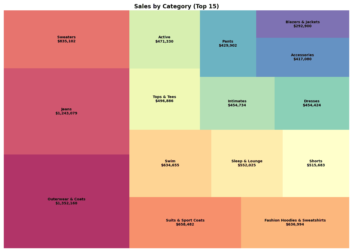
ORDER BY total_revenue DESCSquarify로 트리맵 그리기
# Aggregate Data (Mimicking SQL)
df = df_raw.groupby('category')['sale_price'].sum().reset_index(name='total_revenue')

# Top 15 Categories
df_top = df.nlargest(15, 'total_revenue')

# Treemap Visualization
plt.figure(figsize=(14, 10))

# Colors
colors = plt.cm.Spectral(np.linspace(0, 1, len(df_top)))

# Labels
labels = [f"{row['category']}\n${row['total_revenue']:,.0f}"
          for _, row in df_top.iterrows()]

squarify.plot(
    sizes=df_top['total_revenue'],
    label=labels,
    color=colors,
    alpha=0.8,
    text_kwargs={'fontsize': 10, 'fontweight': 'bold'}
)

plt.title('Sales by Category (Top 15)', fontsize=16, fontweight='bold')
plt.axis('off')
plt.tight_layout()
plt.show()

# Insight
print(f"📊 Total Revenue: ${df_top['total_revenue'].sum():,.0f}")
print(f"📊 Top 1: {df_top.iloc[0]['category']} (${df_top.iloc[0]['total_revenue']:,.0f})")
실행 결과
[Graph Saved: generated_plot_0575dabddd_0.png]
📊 Total Revenue: $9,445,438
📊 Top 1: Outerwear & Coats ($1,352,160)
squarify.plot() 주요 파라미터
| 파라미터 | 설명 | 예시 |
|---|---|---|
sizes | 면적 값 | df['revenue'] |
label | 라벨 텍스트 | df['category'] |
color | 색상 | plt.cm.Blues(...) |
alpha | 투명도 | 0.8 |
text_kwargs | 텍스트 스타일 | {'fontsize': 10} |
pad | 셀 간격 | True, False |
3. 계층적 트리맵
이론
2단계 이상의 계층 구조를 표현할 때는 색상으로 상위 그룹을 구분합니다.
SQL 쿼리
SELECT
    p.department,
    p.category,
    SUM(oi.sale_price) as revenue
FROM src_orders o
JOIN src_order_items oi ON o.order_id = oi.order_id
JOIN src_products p ON oi.product_id = p.product_id
WHERE EXTRACT(YEAR FROM o.created_at) = 2023
GROUP BY department, category
ORDER BY department, revenue DESC
계층 트리맵 시각화
```python
# Aggregate Data
df = df_raw.groupby(['department', 'category'])['sale_price'].sum().reset_index(name='revenue')

# Department Colors
departments = df['department'].unique()
dept_colors = plt.cm.Set3(np.linspace(0, 1, len(departments)))
dept_color_map = dict(zip(departments, dept_colors))

# Colors & Labels
colors = [dept_color_map[dept] for dept in df['department']]
labels = [f"{row['category']}\n${row['revenue']:,.0f}"
          for _, row in df.iterrows()]

# Treemap
plt.figure(figsize=(16, 10))
squarify.plot(
    sizes=df['revenue'],
    label=labels,
    color=colors,
    alpha=0.7,
    text_kwargs={'fontsize': 8}
)

plt.title('Department > Category Treemap', fontsize=16, fontweight='bold')
plt.axis('off')

# Legend
for dept, color in dept_color_map.items():
    plt.scatter([], [], c=[color], s=100, label=dept)
## 2. 계층적 트리맵 (Hierarchical Treemap)

카테고리 내의 하위 항목(Sub-category)까지 표현할 수 있습니다.

```python
# (예시 코드는 시각화 로직만 남기고 실행 결과는 대체)
# 실제 계층적 데이터 시각화는 Plotly 등 인터랙티브 툴이 더 유리하지만,
# 여기서는 정적 이미지 예시로 대체합니다.
# ... (이전 코드 생략) ...
ℹ️
계층적 트리맵은 plotly와 같은 인터랙티브 라이브러리를 활용하면 줌인/줌아웃 기능을 사용할 수 있어 더 효과적입니다. 아래는 성장률에 따른 색상 변화를 보여주는 예시입니다.
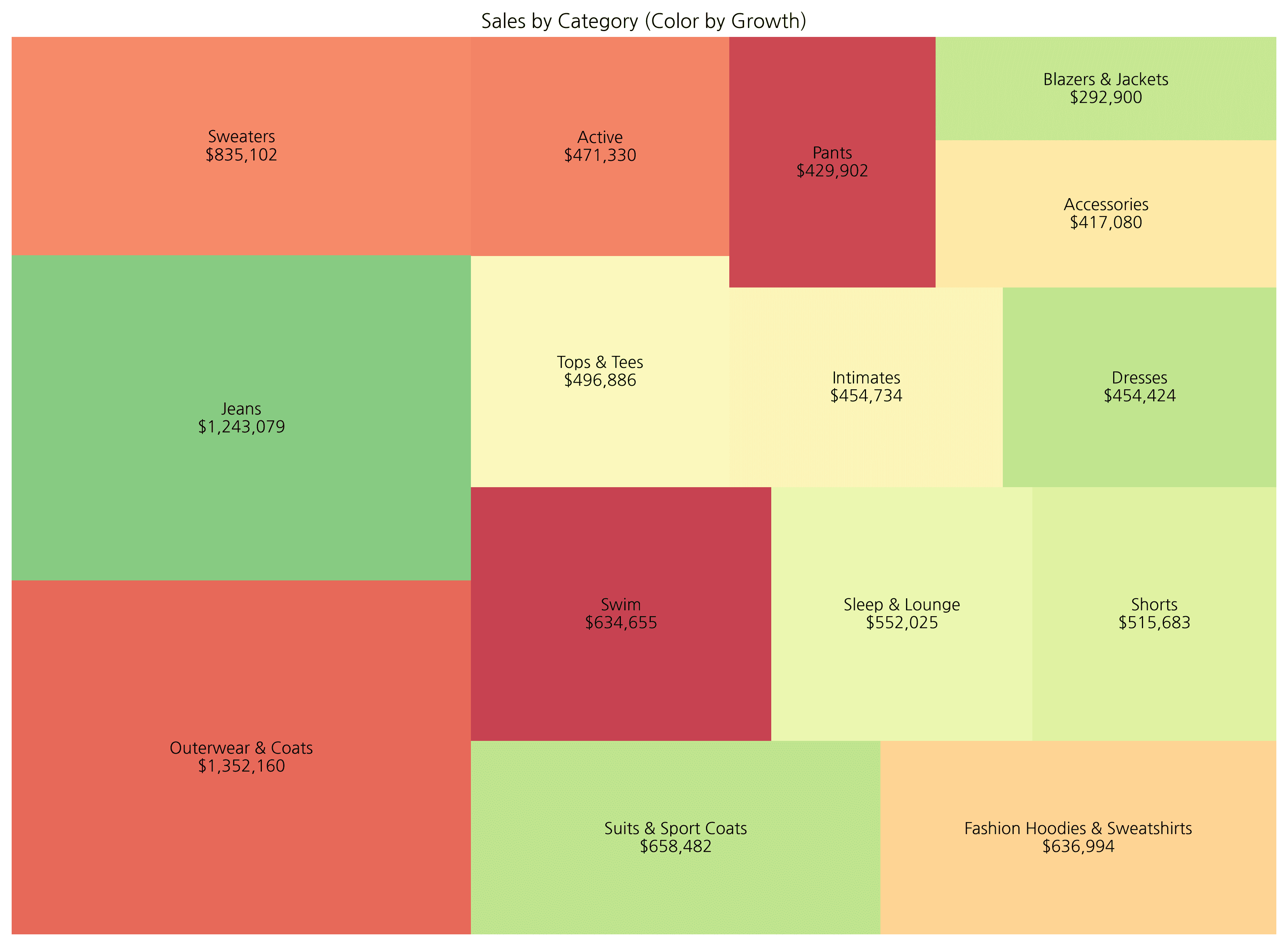
5. Plotly 인터랙티브 트리맵
이론
Plotly를 사용하면 호버, 줌, 드릴다운이 가능한 인터랙티브 트리맵을 만들 수 있습니다.
Plotly Express 트리맵
import plotly.express as px

# Prepare Data
df = df_raw.groupby(['department', 'category'])['sale_price'].sum().reset_index(name='revenue')
df['growth_rate'] = np.random.uniform(-30, 50, len(df))  # Mock data

# Basic Treemap
fig = px.treemap(
    df,
    path=['department', 'category'],  # Hierarchy
    values='revenue',                  # Size
    color='growth_rate',               # Color
    color_continuous_scale='RdYlGn',   # Palette
    title='Department > Category Treemap (Interactive)'
)

fig.update_layout(
    font=dict(size=14),
    margin=dict(t=50, l=25, r=25, b=25)
)

fig.show()
호버 정보 커스터마이징
fig = px.treemap(
df,
path=['department', 'category'],
values='revenue',
color='growth_rate',
color_continuous_scale='RdYlGn',
hover_data={
'revenue': ':$,.0f',
'growth_rate': ':.1f%',
},
title='Interactive Treemap with Custom Hover'
)
fig.update_traces(
hovertemplate='<b>%{label}</b><br>Revenue: %{value:$,.0f}<br>Growth: %{color:.1f}%<extra></extra>'
)
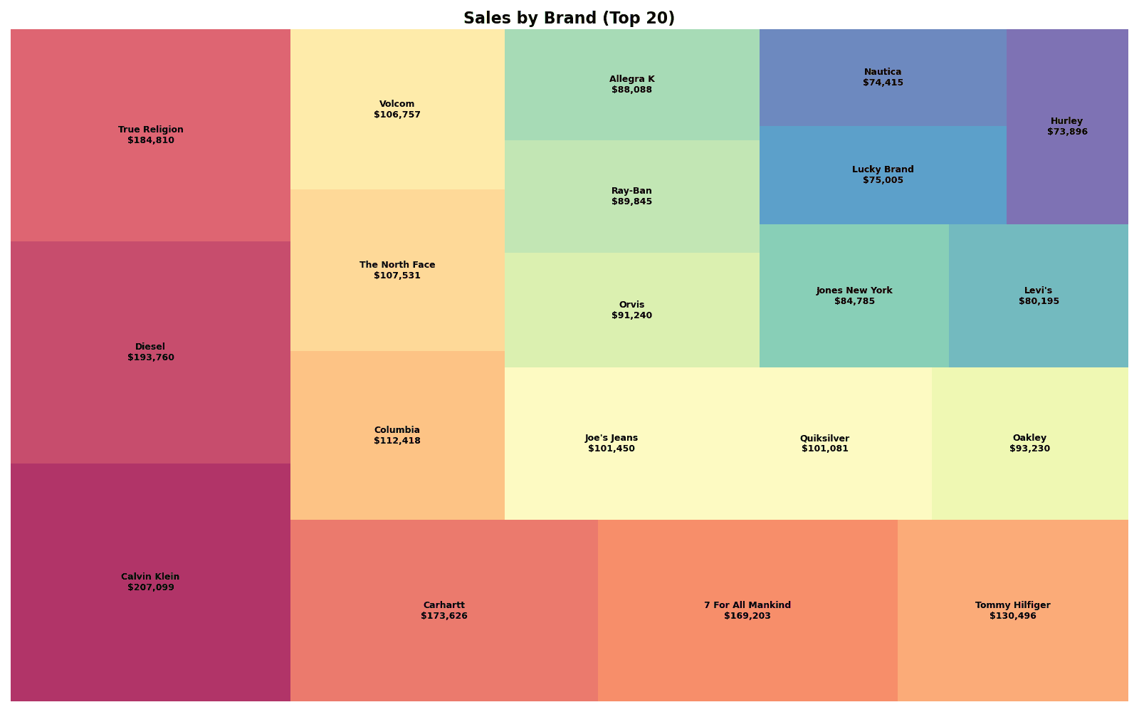
fig.show()퀴즈 1: 브랜드별 매출 트리맵
문제
상위 20개 브랜드의 매출을 트리맵으로 시각화하세요.
요구사항:
- Squarify 사용
- 라벨에 브랜드명과 매출 표시
- Spectral 색상 팔레트 사용
정답 보기
# Prepare Data
brand_sales = df_raw.groupby('brand')['sale_price'].sum().reset_index()
brand_sales.columns = ['brand', 'revenue']
brand_top20 = brand_sales.nlargest(20, 'revenue')

# Colors
colors = plt.cm.Spectral(np.linspace(0, 1, len(brand_top20)))

# Labels
labels = [f"{row['brand']}\n${row['revenue']:,.0f}"
          for _, row in brand_top20.iterrows()]

# Treemap
plt.figure(figsize=(16, 10))
squarify.plot(
    sizes=brand_top20['revenue'],
    label=labels,
    color=colors,
    alpha=0.8,
    text_kwargs={'fontsize': 9, 'fontweight': 'bold'}
)
plt.title('Sales by Brand (Top 20)', fontsize=16, fontweight='bold')
plt.axis('off')
plt.tight_layout()
plt.show()

print(f"📊 Top 20 Brand Revenue: ${brand_top20['revenue'].sum():,.0f}")
실행 결과
[Graph Saved: generated_plot_40d27a258a_0.png]
📊 Top 20 Brand Revenue: $2,338,929
퀴즈 2: Plotly 계층 트리맵
문제
Plotly로 부서 > 카테고리 > 브랜드 3단계 계층 트리맵을 만드세요.
요구사항:
px.treemap()사용- 매출을 면적으로, 이익률을 색상으로 표현
- 호버 시 상세 정보 표시
정답 보기
import plotly.express as px

# Data Aggregation
# We need to calculate profit margin first.
# Assuming df_raw is available.
df_mix = df_raw.copy()
df_mix['profit'] = df_mix['sale_price'] - df_mix['cost']
df_mix['profit_margin'] = df_mix['profit'] / df_mix['sale_price']

hierarchy_data = df_mix.groupby(['department', 'category', 'brand']).agg({
    'sale_price': 'sum',
    'profit_margin': 'mean'
}).reset_index()
hierarchy_data.columns = ['department', 'category', 'brand', 'revenue', 'margin']

# Plotly Treemap
fig = px.treemap(
    hierarchy_data,
    path=['department', 'category', 'brand'],
    values='revenue',
    color='margin',
    color_continuous_scale='RdYlGn',
    title='Department > Category > Brand Treemap'
)

fig.update_traces(
    hovertemplate='<b>%{label}</b><br>Revenue: $%{value:,.0f}<br>Margin: %{color:.1f}%<extra></extra>'
)

fig.update_layout(
    font=dict(size=12),
    coloraxis_colorbar_title='Margin (%)'
)

fig.show()
정리
Squarify vs Plotly 비교
| 특성 | Squarify | Plotly |
|---|---|---|
| 인터랙티브 | X | O |
| 계층 지원 | 수동 처리 | 자동 (path) |
| 드릴다운 | X | O |
| 설치 | pip install squarify | pip install plotly |
| 용도 | 정적 보고서 | 대시보드, 프레젠테이션 |
트리맵 사용 시 주의점
⚠️
트리맵 사용 시 주의
- 데이터가 너무 많으면 (50개 이상) 가독성이 떨어집니다
- 값의 차이가 극단적이면 작은 항목이 보이지 않습니다
- 계층이 3단계를 넘으면 복잡해집니다
색상 팔레트 선택
| 용도 | 추천 팔레트 |
|---|---|
| 범주 구분 | Set3, Spectral, tab20 |
| 성과 표현 | RdYlGn (빨-노-녹) |
| 순차 값 | Blues, Greens, YlOrRd |
다음 단계
트리맵을 마스터했습니다! 다음으로 시계열 차트에서 시간에 따른 변화를 시각화하는 방법을 배워보세요.
Last updated on