Distribution Visualization
Learning Objectives
After completing this recipe, you will be able to:
- Understand data distribution with histograms
- Detect outliers with box plots
- Compare distributions with violin plots
- Estimate density with KDE plots
0. Setup
Load CSV files for data practice.
import pandas as pd
import seaborn as sns
import matplotlib.pyplot as plt

# Load Data
# Load Data
orders = pd.read_csv('src_orders.csv', parse_dates=['created_at'])
items = pd.read_csv('src_order_items.csv')
users = pd.read_csv('src_users.csv')
df = orders.merge(items, on='order_id').merge(users, on='user_id')
1. Histogram
Theory
A histogram divides continuous data into intervals (bins) and represents the frequency as bars. It’s useful for understanding the shape of the distribution (normal, skewed, bimodal, etc.).
Basic Histogram
import pandas as pd
import matplotlib.pyplot as plt
import seaborn as sns

# Basic histogram
plt.figure(figsize=(12, 5))

plt.subplot(1, 2, 1)
plt.hist(df['sale_price'], bins=30, color='steelblue', edgecolor='white', alpha=0.7)
plt.title('Sale Price Distribution (Matplotlib)', fontsize=14, fontweight='bold')
plt.xlabel('Sale Price ($)')
plt.ylabel('Frequency')

plt.subplot(1, 2, 2)
sns.histplot(df['sale_price'], bins=30, kde=True, color='coral')
plt.title('Sale Price Distribution (Seaborn + KDE)', fontsize=14, fontweight='bold')
plt.xlabel('Sale Price ($)')

plt.tight_layout()
plt.show()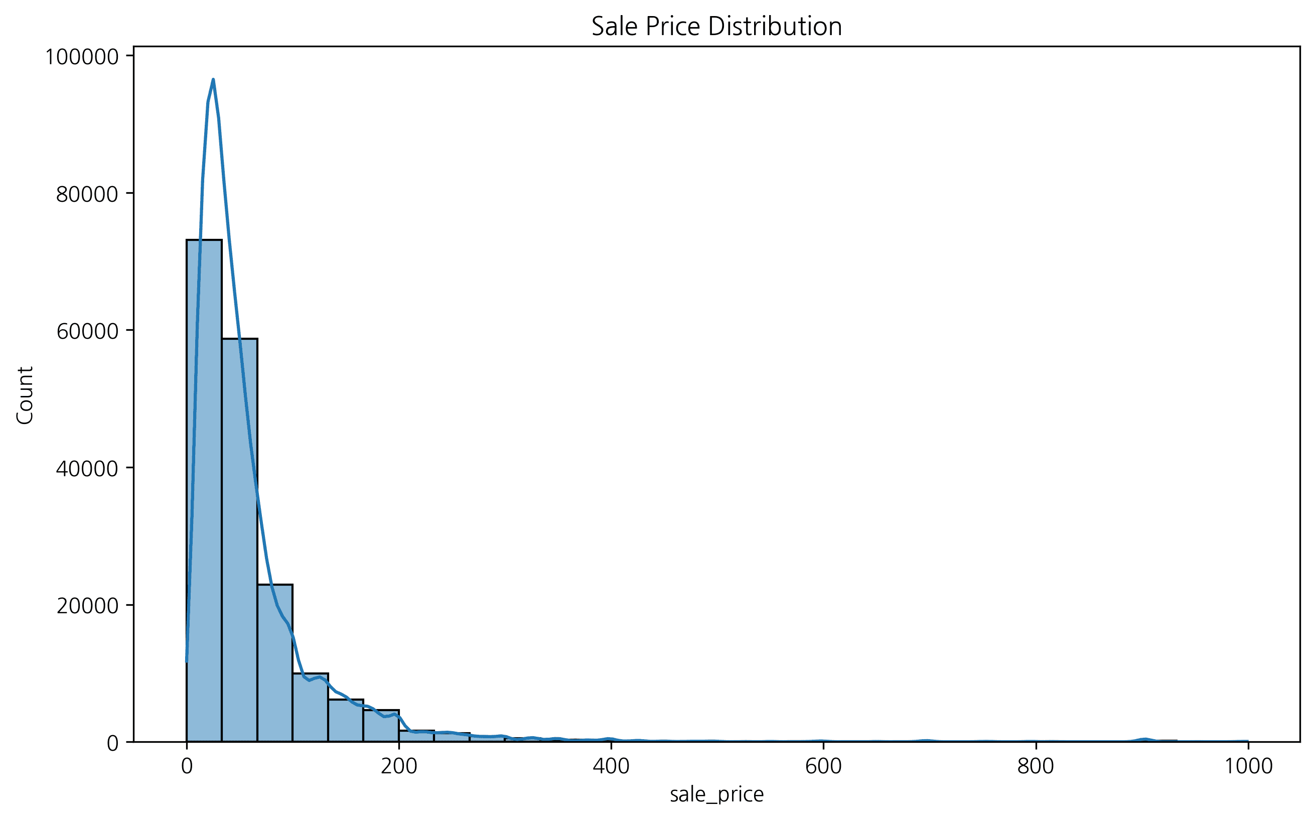
2. Setting the Number of Bins
You can adjust the number of histogram bars using the bins parameter. Data interpretation can vary depending on the bin settings.
fig, axes = plt.subplots(1, 3, figsize=(15, 5))

sns.histplot(df['sale_price'], bins=10, ax=axes[0], color='skyblue')
axes[0].set_title('Bins = 10')

sns.histplot(df['sale_price'], bins=30, ax=axes[1], color='orange')
axes[1].set_title('Bins = 30')

sns.histplot(df['sale_price'], bins=50, ax=axes[2], color='green')
axes[2].set_title('Bins = 50')

plt.tight_layout()
plt.show()
If there are too few bins, the data characteristics get blurred; if there are too many, noise becomes severe. Proper bin settings are important.
3. Grouped Histogram
You can compare how data distribution differs according to categorical variables. For example, let’s check the sale price distribution by gender.
plt.figure(figsize=(10, 6))
sns.histplot(data=df, x='sale_price', hue='gender', kde=True, element='step')
plt.title('Sale Price Distribution by Gender')
plt.xlabel('Sale Price')
plt.ylabel('Count')
plt.legend(title='Gender')
plt.show()
4. Box Plot
Great for understanding data distribution and outliers at a glance.
plt.figure(figsize=(12, 6))
sns.boxplot(x='category', y='sale_price', data=df)
plt.xticks(rotation=45)
plt.title('Price Distribution by Category')
plt.show()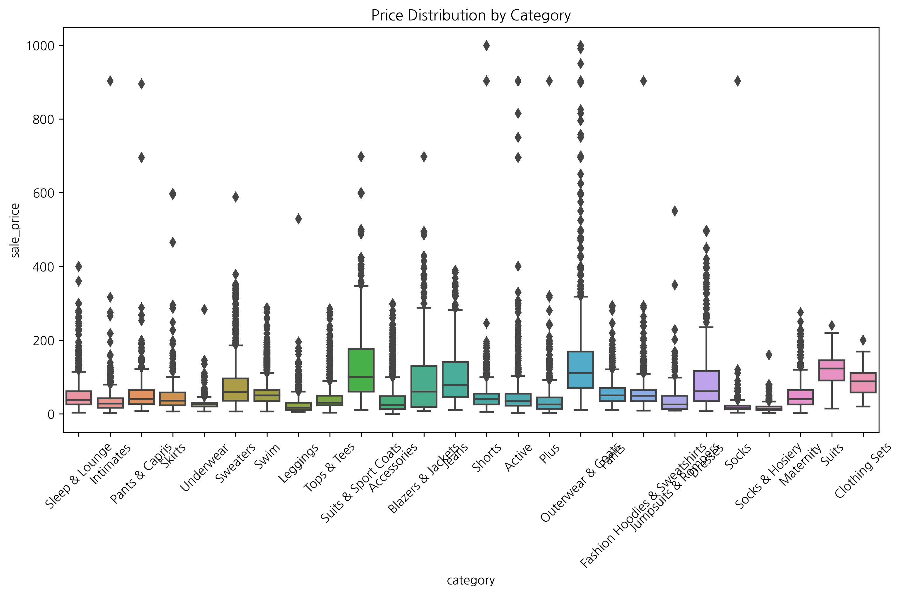
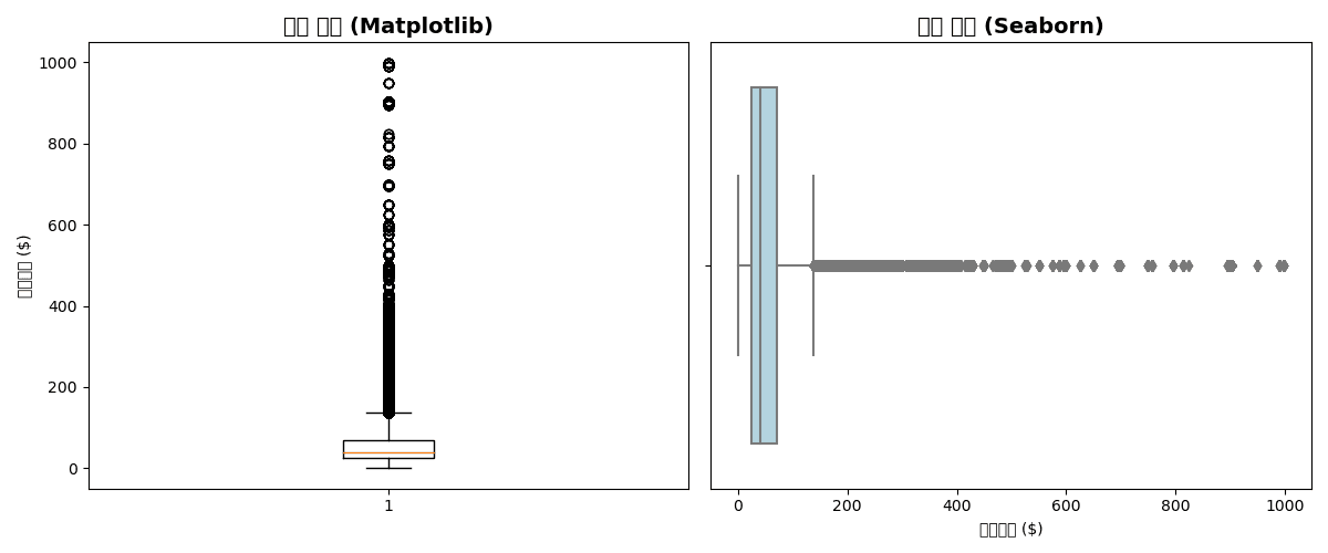
2. Box Plot
Theory
A box plot visualizes the five-number summary (minimum, Q1, median, Q3, maximum) and outliers.
Box Plot Components:
- Box: Q1 ~ Q3 (IQR)
- Center line: Median
- Whiskers: Q1 - 1.5×IQR ~ Q3 + 1.5×IQR
- Points: Outliers
Basic Box Plot
plt.figure(figsize=(12, 5))

# Matplotlib
plt.subplot(1, 2, 1)
plt.boxplot(df['sale_price'].dropna())
plt.title('Price Distribution (Matplotlib)', fontsize=14, fontweight='bold')
plt.ylabel('Sale Price ($)')

# Seaborn (horizontal)
plt.subplot(1, 2, 2)
sns.boxplot(x=df['sale_price'], color='lightblue')
plt.title('Price Distribution (Seaborn)', fontsize=14, fontweight='bold')
plt.xlabel('Sale Price ($)')

plt.tight_layout()
plt.show()[Graph Saved: generated_plot_1d8420747f_0.png]
Box Plot by Group
plt.figure(figsize=(14, 6))

# Price distribution by department
sns.boxplot(
    data=df,
    x='department',
    y='sale_price',
    palette='Set2',
    showfliers=True  # Show outliers
)

plt.title('Sale Price Distribution by Department', fontsize=14, fontweight='bold')
plt.xlabel('Department')
plt.ylabel('Sale Price ($)')
plt.tight_layout()
plt.show()

# Statistical summary
print("📊 Statistics by Department:")
print(df.groupby('department')['sale_price'].describe().round(2))Error: Could not interpret input 'department'
Grouped Box Plot
plt.figure(figsize=(14, 6))

# Department × Gender
sns.boxplot(
    data=df,
    x='department',
    y='sale_price',
    hue='gender',
    palette=['lightcoral', 'lightblue']
)

plt.title('Sale Price Distribution by Department/Gender', fontsize=14, fontweight='bold')
plt.xlabel('Department')
plt.ylabel('Sale Price ($)')
plt.legend(title='Gender')
plt.tight_layout()
plt.show()Error: Could not interpret input 'department'
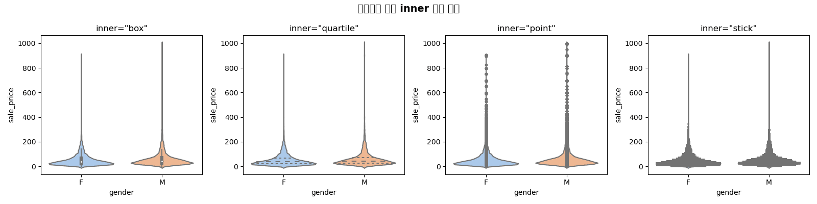
3. Violin Plot
Theory
A violin plot is a combination of box plot + KDE (kernel density estimation). It allows you to see the shape of the distribution in more detail.
Basic Violin Plot
plt.figure(figsize=(14, 6))

sns.violinplot(
    data=df,
    x='department',
    y='sale_price',
    palette='Set2',
    inner='box'  # Box plot inside
)

plt.title('Price Distribution by Department (Violin Plot)', fontsize=14, fontweight='bold')
plt.xlabel('Department')
plt.ylabel('Sale Price ($)')
plt.tight_layout()
plt.show()Error: Could not interpret input 'department'
Inner Options
fig, axes = plt.subplots(1, 4, figsize=(16, 4))
inner_options = ['box', 'quartile', 'point', 'stick']

for ax, inner in zip(axes, inner_options):
    sns.violinplot(
        data=df,
        x='gender',
        y='sale_price',
        inner=inner,
        ax=ax,
        palette='pastel'
    )
    ax.set_title(f'inner="{inner}"', fontsize=12)

plt.suptitle('Violin Plot Inner Options Comparison', fontsize=14, fontweight='bold')
plt.tight_layout()
plt.show()[Graph Saved: generated_plot_775a688b4b_0.png]
Split Violin
plt.figure(figsize=(14, 6))

sns.violinplot(
    data=df,
    x='department',
    y='sale_price',
    hue='gender',
    split=True,  # Show half on each side
    palette=['lightcoral', 'lightblue'],
    inner='quartile'
)

plt.title('Price Distribution by Department/Gender (Split Violin)', fontsize=14, fontweight='bold')
plt.xlabel('Department')
plt.ylabel('Sale Price ($)')
plt.legend(title='Gender')
plt.tight_layout()
plt.show()Error: Could not interpret input 'department'
4. KDE Plot (Kernel Density Estimation)
Theory
KDE is a continuous probability density function that smooths a histogram. It’s useful for comparing distribution shapes.
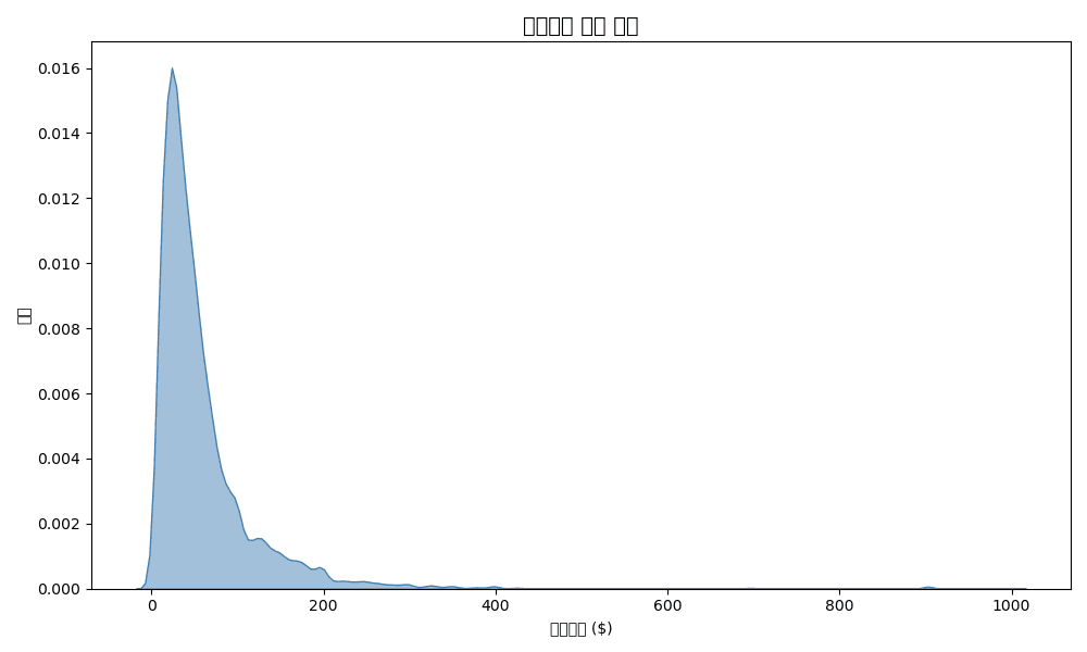
Basic KDE
plt.figure(figsize=(10, 6))

# Single KDE
sns.kdeplot(df['sale_price'], fill=True, color='steelblue', alpha=0.5)

plt.title('Sale Price Density Distribution', fontsize=14, fontweight='bold')
plt.xlabel('Sale Price ($)')
plt.ylabel('Density')
plt.tight_layout()
plt.show()[Graph Saved: generated_plot_be63fa9bdc_0.png]
KDE Comparison by Group
plt.figure(figsize=(12, 6))

# KDE by department
for dept in df['department'].unique():
    dept_data = df[df['department'] == dept]['sale_price']
    sns.kdeplot(dept_data, label=dept, fill=True, alpha=0.3)

plt.title('Price Distribution Comparison by Department', fontsize=14, fontweight='bold')
plt.xlabel('Sale Price ($)')
plt.ylabel('Density')
plt.legend(title='Department')
plt.tight_layout()
plt.show()Error: 'department'
2D KDE (Joint Distribution)
plt.figure(figsize=(10, 8))

sns.kdeplot(
    data=df,
    x='retail_price',
    y='sale_price',
    cmap='Blues',
    fill=True,
    levels=10,
    thresh=0.05
)

plt.title('Retail Price vs Sale Price Joint Distribution', fontsize=14, fontweight='bold')
plt.xlabel('Retail Price ($)')
plt.ylabel('Sale Price ($)')
plt.tight_layout()
plt.show()Error: Could not interpret value `retail_price` for parameter `x`
5. Combined Distribution Plots
Seaborn JointPlot
# Scatter plot + Histogram
g = sns.jointplot(
    data=df,
    x='retail_price',
    y='sale_price',
    kind='scatter',
    height=8,
    alpha=0.5
)
g.fig.suptitle('Retail Price vs Sale Price Relationship', fontsize=14, fontweight='bold', y=1.02)
plt.show()Error: Could not interpret value `retail_price` for parameter `x`
PairPlot (Multivariate Distribution)
# Relationships between numeric variables
numeric_cols = ['retail_price', 'cost', 'sale_price', 'num_of_item']
sns.pairplot(
    df[numeric_cols].sample(1000),  # Sampling
    diag_kind='kde',
    plot_kws={'alpha': 0.5}
)
plt.suptitle('Numeric Variable Relationships', fontsize=14, fontweight='bold', y=1.02)
plt.show()Error: "['retail_price', 'cost'] not in index"
Quiz 1: Distribution Comparison
Problem
Compare the sale price distribution by department using these 3 methods:
- Histogram (overlapping, density normalized)
- Box plot
- Violin plot
View Answer
fig, axes = plt.subplots(1, 3, figsize=(18, 5))

# 1. Histogram
sns.histplot(
    data=df,
    x='sale_price',
    hue='department',
    stat='density',
    common_norm=False,
    alpha=0.5,
    ax=axes[0]
)
axes[0].set_title('Histogram', fontsize=12, fontweight='bold')
axes[0].set_xlabel('Sale Price ($)')

# 2. Box plot
sns.boxplot(
    data=df,
    x='department',
    y='sale_price',
    palette='Set2',
    ax=axes[1]
)
axes[1].set_title('Box Plot', fontsize=12, fontweight='bold')
axes[1].tick_params(axis='x', rotation=45)

# 3. Violin plot
sns.violinplot(
    data=df,
    x='department',
    y='sale_price',
    palette='Set2',
    inner='quartile',
    ax=axes[2]
)
axes[2].set_title('Violin Plot', fontsize=12, fontweight='bold')
axes[2].tick_params(axis='x', rotation=45)

plt.suptitle('Sale Price Distribution Comparison by Department', fontsize=14, fontweight='bold')
plt.tight_layout()
plt.show()Error: Could not interpret value `department` for parameter `hue`
Quiz 2: Outlier Analysis
Problem
Analyze sale price outliers by category:
- Create box plots for the top 10 categories
- Calculate the number of outliers for each category
- Print the 3 categories with the most outliers
View Answer
# Top 10 categories
top_10_cat = df.groupby('category')['sale_price'].sum().nlargest(10).index
df_top10 = df[df['category'].isin(top_10_cat)]

# Box plot
plt.figure(figsize=(14, 6))
sns.boxplot(
    data=df_top10,
    x='category',
    y='sale_price',
    palette='Set3',
    order=top_10_cat
)
plt.title('Price Distribution for Top 10 Categories', fontsize=14, fontweight='bold')
plt.xticks(rotation=45, ha='right')
plt.tight_layout()
plt.show()

# Calculate outlier count (IQR method)
def count_outliers(group):
    Q1 = group.quantile(0.25)
    Q3 = group.quantile(0.75)
    IQR = Q3 - Q1
    lower = Q1 - 1.5 * IQR
    upper = Q3 + 1.5 * IQR
    return ((group < lower) | (group > upper)).sum()

outlier_counts = df_top10.groupby('category')['sale_price'].apply(count_outliers)
outlier_counts = outlier_counts.sort_values(ascending=False)

print("📊 Outlier Count by Category:")
print(outlier_counts)

print(f"\n🔴 Top 3 Categories with Most Outliers:")
for cat, count in outlier_counts.head(3).items():
print(f" - {cat}: {count}")Error: 'category'
Summary
Distribution Visualization Selection Guide
| Purpose | Recommended Chart |
|---|---|
| Single variable distribution | Histogram, KDE |
| Group comparison | Box plot, Violin |
| Outlier detection | Box plot |
| Detailed distribution shape | Violin + KDE |
| Two variable relationship | Joint plot, 2D KDE |
| Multivariate relationship | Pair plot |
Seaborn Distribution Function Summary
| Function | Purpose | Example |
|---|---|---|
histplot() | Histogram | sns.histplot(df, x='col') |
kdeplot() | KDE | sns.kdeplot(df['col']) |
boxplot() | Box plot | sns.boxplot(data=df, x='cat', y='val') |
violinplot() | Violin | sns.violinplot(data=df, x='cat', y='val') |
jointplot() | Joint | sns.jointplot(data=df, x='x', y='y') |
pairplot() | Pair | sns.pairplot(df) |
Next Steps
You’ve mastered distribution visualization! Now learn statistical techniques for data-driven decision making in the Statistical Analysis section.