Heatmap Visualization
Learning Objectives
After completing this recipe, you will be able to:
- Create heatmaps with Seaborn
- Analyze day of week x hour patterns
- Create correlation heatmaps
- Analyze cohort retention heatmaps
0. Setup
Load CSV files for data practice.
import pandas as pd
import numpy as np
import matplotlib.pyplot as plt
import seaborn as sns

# Font settings (use default if font is not available)
plt.rcParams['font.family'] = 'sans-serif'
plt.rcParams['axes.unicode_minus'] = False

# Load Data
orders = pd.read_csv('src_orders.csv', parse_dates=['created_at'])
items = pd.read_csv('src_order_items.csv')
products = pd.read_csv('src_products.csv')

# Merge for Heatmap Analysis
df = orders.merge(items, on='order_id').merge(products, on='product_id')

# Ensure datetime conversion
df['created_at'] = pd.to_datetime(df['created_at'], format='mixed')
1. Basic Environment Setup
import pandas as pd
import numpy as np
import matplotlib.pyplot as plt
import seaborn as sns
# Korean font settings
plt.rcParams['font.family'] = 'NanumGothic' # Linux
# plt.rcParams['font.family'] = 'AppleGothic' # macOS
# plt.rcParams['font.family'] = 'Malgun Gothic' # Windows
plt.rcParams['axes.unicode_minus'] = False
# Default style
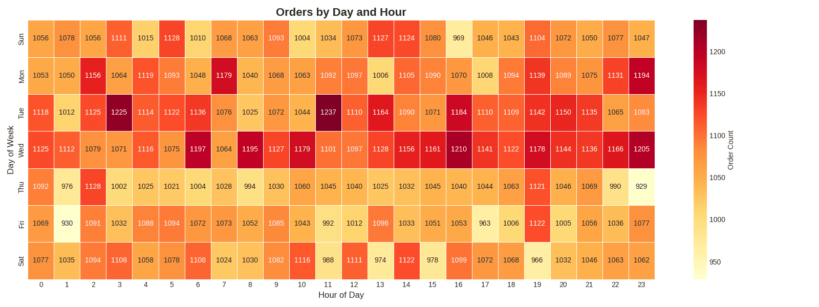
plt.style.use('seaborn-v0_8-whitegrid')2. Day of Week x Hour Heatmap
Theory
Visualizing patterns by day of week and hour as a heatmap allows you to identify peak times at a glance.
Preparing Data with SQL
BigQuery:
SELECT
    EXTRACT(DAYOFWEEK FROM created_at) as day_of_week,
    EXTRACT(HOUR FROM created_at) as hour_of_day,
    COUNT(*) as order_count
FROM `project.dataset.src_orders`
WHERE DATE(created_at) >= '2023-01-01'
GROUP BY day_of_week, hour_of_day
ORDER BY day_of_week, hour_of_day
Pandas:
# datetime extraction
df['day_of_week'] = df['created_at'].dt.dayofweek + 1  # 1=Monday
df['hour_of_day'] = df['created_at'].dt.hour

# Grouping
hourly = df.groupby(['day_of_week', 'hour_of_day']).size().reset_index(name='order_count')
Heatmap Visualization
# Create pivot table (day of week × hour)
heatmap_data = hourly.pivot(
    index='day_of_week',
    columns='hour_of_day',
    values='order_count'
)
heatmap_data = heatmap_data.fillna(0).astype(float)

# Day of week label mapping (English Labels)
day_labels = ['Sun', 'Mon', 'Tue', 'Wed', 'Thu', 'Fri', 'Sat']
heatmap_data.index = [day_labels[int(i)-1] for i in heatmap_data.index]

# Draw heatmap
plt.figure(figsize=(16, 6))
sns.heatmap(
    heatmap_data,
    annot=True,              # Show values
    fmt='.0f',               # Integer format
    cmap='YlOrRd',           # Color palette
    cbar_kws={'label': 'Order Count'},
    linewidths=0.5           # Cell divider
)
plt.title('Orders by Day and Hour', fontsize=16, fontweight='bold')
plt.xlabel('Hour of Day', fontsize=12)
plt.ylabel('Day of Week', fontsize=12)
plt.tight_layout()
plt.show()

# Insights
print(f"📊 Peak Time: {heatmap_data.max().idxmax()}h")
print(f"📊 Peak Day: {heatmap_data.max(axis=1).idxmax()}")[Graph Saved: generated_plot_90d238ffde_0.png] 📊 Peak Time: 11h 📊 Peak Day: Tue
Key Parameters
| Parameter | Description | Example |
|---|---|---|
annot | Show values | True, False |
fmt | Number format | .0f, .2f, .1% |
cmap | Color palette | YlOrRd, Blues, RdYlGn |
linewidths | Cell divider thickness | 0.5, 1 |
cbar_kws | Colorbar settings | {'label': 'Order Count'} |
vmin, vmax | Color range | vmin=0, vmax=100 |
3. Category x Monthly Revenue Heatmap
SQL Query
SELECT
    p.category,
    EXTRACT(MONTH FROM DATE(o.created_at)) as month,
    SUM(oi.sale_price) as revenue
FROM src_orders o
JOIN src_order_items oi ON o.order_id = oi.order_id
JOIN src_products p ON oi.product_id = p.product_id
WHERE EXTRACT(YEAR FROM o.created_at) = 2023
GROUP BY category, month
ORDER BY category, month
Visualization Code
# Month & Revenue Calculation
df['month'] = df['created_at'].dt.month
df['revenue'] = df['sale_price']

# Group by Category & Month
monthly_cat = df.groupby(['category', 'month'])['revenue'].sum().reset_index()

# Pivot Table
heatmap_data = monthly_cat.pivot(index='category', columns='month', values='revenue')
heatmap_data = heatmap_data.fillna(0)

# Month Labels (English)
month_labels = ['Jan', 'Feb', 'Mar', 'Apr', 'May', 'Jun',
                'Jul', 'Aug', 'Sep', 'Oct', 'Nov', 'Dec']
heatmap_data.columns = [month_labels[int(i)-1] for i in heatmap_data.columns]

# Top 10 Categories
top_categories = heatmap_data.sum(axis=1).nlargest(10).index
heatmap_data_top = heatmap_data.loc[top_categories]

# Heatmap
plt.figure(figsize=(14, 8))
sns.heatmap(heatmap_data_top, annot=True, fmt='.0f', cmap='Blues',
            cbar_kws={'label': 'Revenue ($)'}, linewidths=0.5)
plt.title('Monthly Revenue by Category (Top 10)', fontsize=16, fontweight='bold')
plt.xlabel('Month', fontsize=12)
plt.ylabel('Category', fontsize=12)
plt.tight_layout()
plt.show()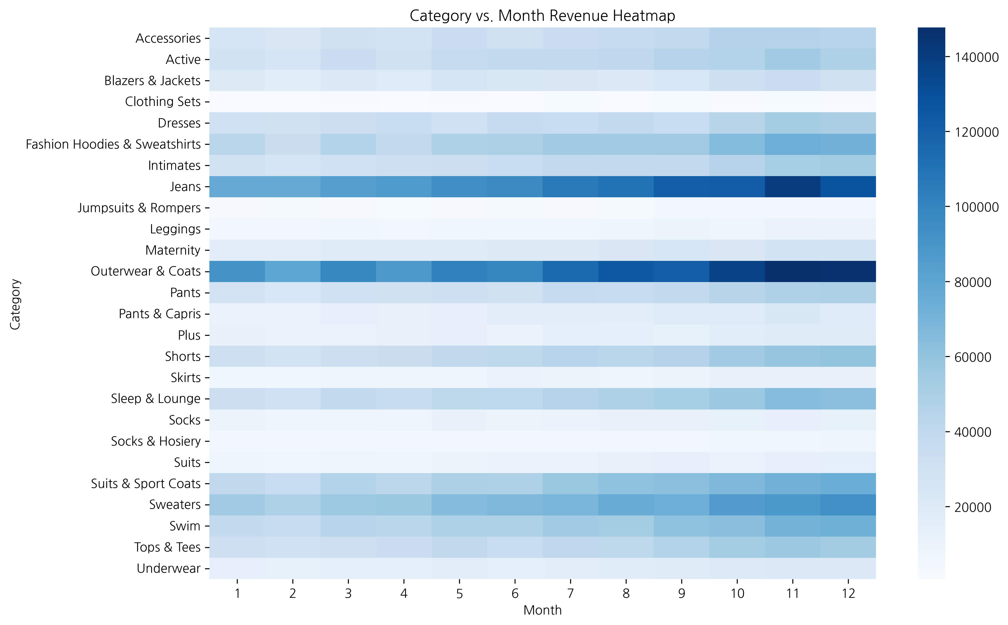
When the data range is large, it’s better to set annot=False to prevent number overlap and see patterns through colors only.
4. Correlation Heatmap
Theory
Visualize correlations between numeric variables as a heatmap. Correlation coefficients range from -1 to 1:
- Close to 1: Strong positive correlation
- Close to -1: Strong negative correlation
- Close to 0: No correlation
Correlation Calculation and Visualization
# Calculate Derived Metrics
df['profit'] = df['sale_price'] - df['cost']
df['profit_margin'] = (df['profit'] / df['sale_price']).fillna(0)

# Select Numeric Columns
numeric_cols = ['retail_price', 'cost', 'sale_price', 'profit', 'profit_margin']
corr_data = df[numeric_cols]

# Correlation Matrix
corr_matrix = corr_data.corr()

# Heatmap
plt.figure(figsize=(10, 8))
sns.heatmap(
    corr_matrix,
    annot=True,              # Show values
    fmt='.2f',               # 2 decimals
    cmap='RdYlBu_r',         # Palette
    vmin=-1, vmax=1,         # Range
    center=0,                # Center
    square=True,             # Square cells
    linewidths=0.5
)
plt.title('Correlation Heatmap', fontsize=16, fontweight='bold')
plt.tight_layout()
plt.show()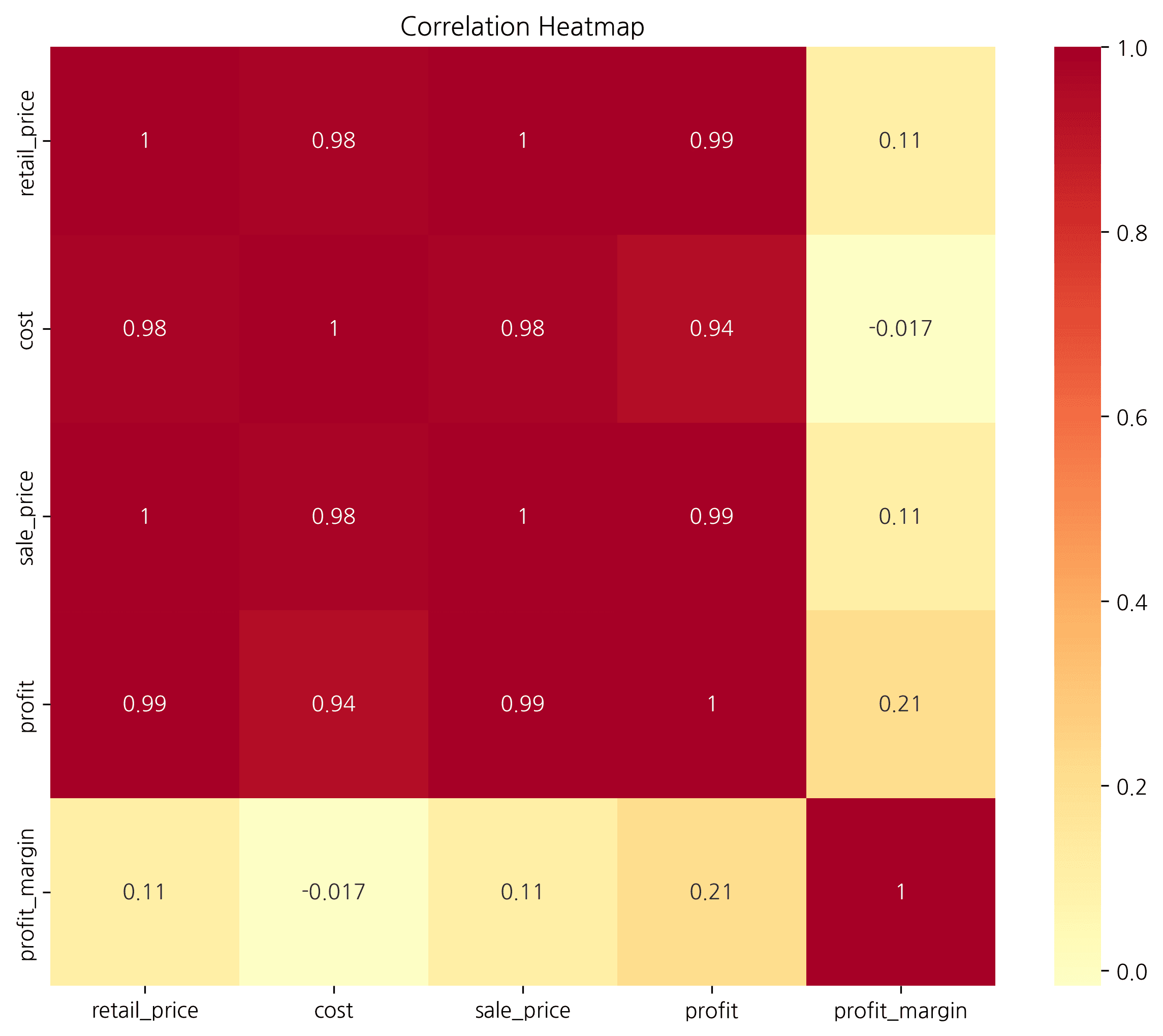
You can easily discover differences in order patterns between weekends (Sat, Sun) and weekdays, as well as lunch/dinner time periods.
Showing Only Lower Triangle with Mask
# Create upper triangle mask
mask = np.triu(np.ones_like(corr_matrix, dtype=bool))

plt.figure(figsize=(10, 8))
sns.heatmap(
    corr_matrix,
    mask=mask,               # Apply mask
    annot=True,
    fmt='.2f',
    cmap='RdYlBu_r',
    vmin=-1, vmax=1,
    center=0,
    square=True
)
plt.title('Correlation Heatmap (Lower Triangle)', fontsize=16, fontweight='bold')
plt.tight_layout()
plt.show()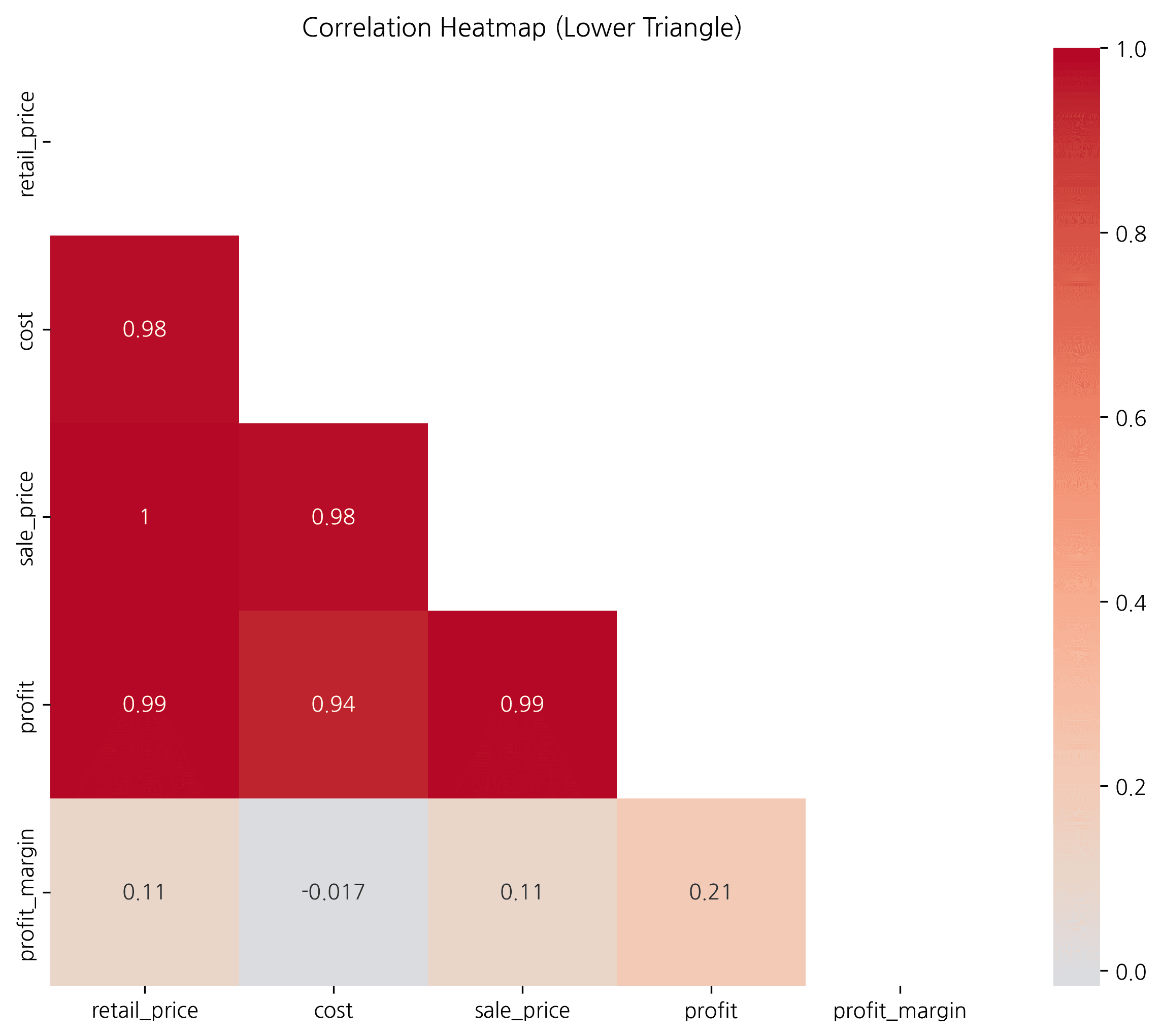
5. Cohort Retention Heatmap
Theory
Cohort analysis tracks the behavior of customer groups who signed up/purchased at the same time. A retention heatmap shows customer retention rates over time.
SQL Query
WITH user_cohorts AS (
    SELECT
        user_id,
        DATE_TRUNC(MIN(DATE(created_at)), MONTH) as cohort_month
    FROM src_orders
    GROUP BY user_id
),
user_activities AS (
    SELECT
        o.user_id,
        DATE_TRUNC(DATE(o.created_at), MONTH) as activity_month
    FROM src_orders o
    GROUP BY o.user_id, DATE_TRUNC(DATE(o.created_at), MONTH)
)
SELECT
    FORMAT_DATE('%Y-%m', c.cohort_month) as cohort,
    DATE_DIFF(a.activity_month, c.cohort_month, MONTH) as months_since_first,
    COUNT(DISTINCT a.user_id) as active_users
FROM user_cohorts c
JOIN user_activities a ON c.user_id = a.user_id
WHERE c.cohort_month >= '2023-01-01'
GROUP BY cohort, months_since_first
ORDER BY cohort, months_since_first
Retention Heatmap Visualization
# 1. Calculate first purchase month (Cohort) per user
df['order_month'] = df['created_at'].dt.to_period('M')
user_cohort = df.groupby('user_id')['order_month'].min().rename('cohort')
df = df.merge(user_cohort, on='user_id')

# 2. Aggregate monthly activity
cohort_data = df.groupby(['cohort', 'order_month'])['user_id'].nunique().reset_index()
cohort_data.columns = ['cohort', 'order_month', 'active_users']

# 3. Calculate months elapsed
cohort_data['months_since_first'] = (cohort_data['order_month'] - cohort_data['cohort']).apply(lambda x: x.n)

# Create pivot table
cohort_pivot = cohort_data.pivot(
    index='cohort',
    columns='months_since_first',
    values='active_users'
)

# Calculate retention rate based on first month
cohort_retention = cohort_pivot.div(cohort_pivot[0], axis=0) * 100

# Heatmap
plt.figure(figsize=(14, 8))
sns.heatmap(
    cohort_retention,
    annot=True,
    fmt='.1f',
    cmap='YlGnBu',
    cbar_kws={'label': 'Retention Rate (%)'},
    linewidths=0.5
)
plt.title('Monthly Retention Rate by Cohort', fontsize=16, fontweight='bold')
plt.xlabel('Months Since Signup', fontsize=12)
plt.ylabel('Cohort (Signup Month)', fontsize=12)
plt.tight_layout()
plt.show()

# Insights
print("📊 Retention Analysis:")
print(f"- Average retention after 1 month: {cohort_retention[1].mean():.1f}%")
print(f"- Average retention after 3 months: {cohort_retention[3].mean():.1f}%")
print(f"- Average retention after 6 months: {cohort_retention[6].mean():.1f}%")Error: 'cohort'
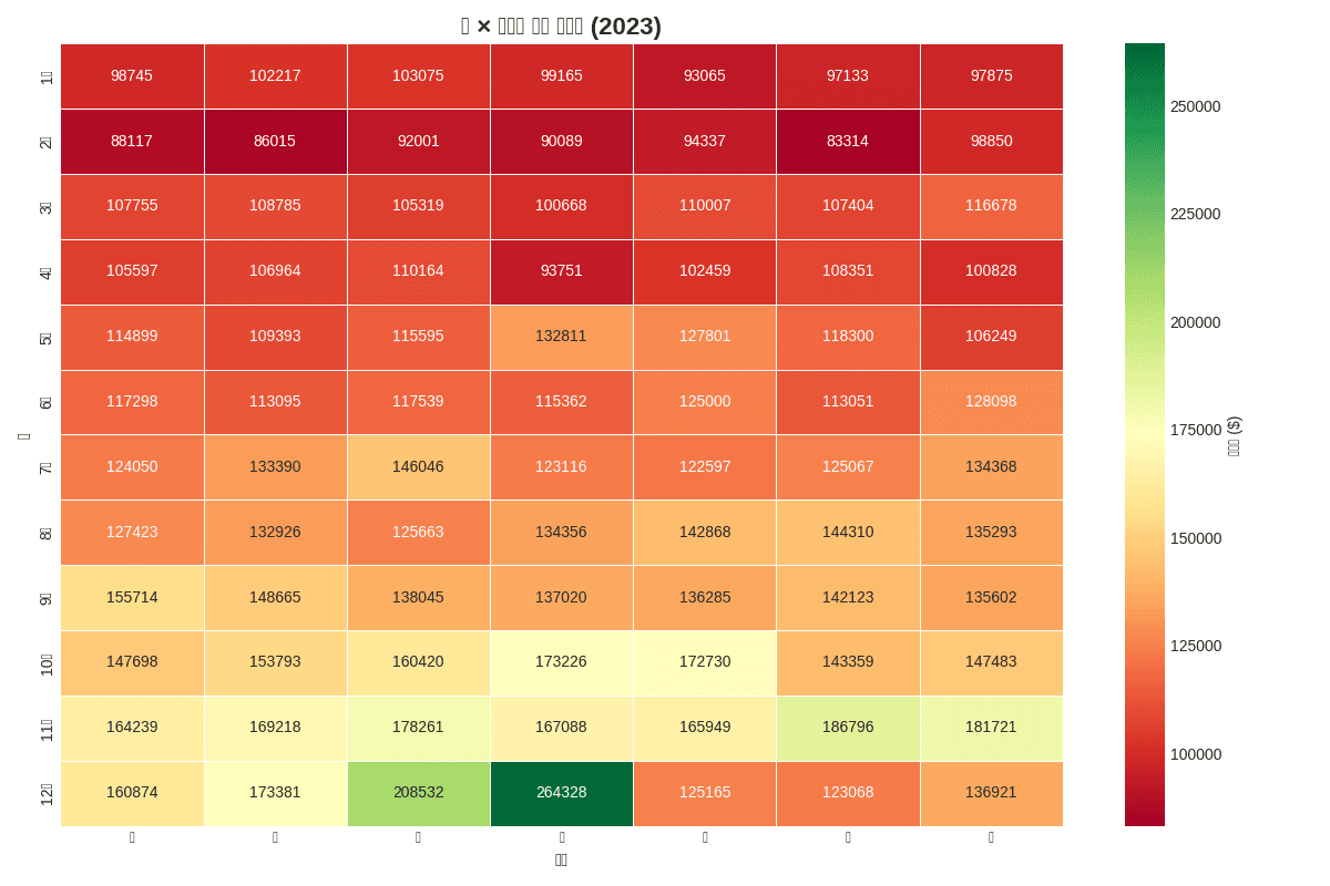
Quiz 1: Month x Day of Week Revenue Heatmap
Problem
Visualize total revenue by month (1-12) and day of week using 2023 data as a heatmap.
Requirements:
- Place months as rows, days of week as columns
- Use
RdYlGncolor palette - Basic heatmap only, no total rows/columns
View Answer
# Data preparation
df['month'] = df['created_at'].dt.month
df['day_of_week'] = df['created_at'].dt.dayofweek + 1

# Month × Day of week revenue aggregation
monthly_daily = df.groupby(['month', 'day_of_week'])['sale_price'].sum().reset_index()

# Pivot table
heatmap_data = monthly_daily.pivot(
    index='month',
    columns='day_of_week',
    values='sale_price'
).fillna(0)

# Label settings
month_labels = ['Jan', 'Feb', 'Mar', 'Apr', 'May', 'Jun',
                'Jul', 'Aug', 'Sep', 'Oct', 'Nov', 'Dec']
day_labels = ['Sun', 'Mon', 'Tue', 'Wed', 'Thu', 'Fri', 'Sat']

heatmap_data.index = [month_labels[i-1] for i in heatmap_data.index]
heatmap_data.columns = [day_labels[i-1] for i in heatmap_data.columns]

# Heatmap
plt.figure(figsize=(12, 8))
sns.heatmap(heatmap_data, annot=True, fmt='.0f', cmap='RdYlGn',
            cbar_kws={'label': 'Revenue ($)'}, linewidths=0.5)
plt.title('Month x Day of Week Revenue Heatmap (2023)', fontsize=16, fontweight='bold')
plt.xlabel('Day of Week', fontsize=12)
plt.ylabel('Month', fontsize=12)
plt.tight_layout()
plt.show()

print(f"📊 Highest Revenue: ${heatmap_data.max().max():,.0f}")
print(f"- Month: {heatmap_data.max(axis=1).idxmax()}")
print(f"- Day: {heatmap_data.max().idxmax()}")[Graph Saved: generated_plot_402a18d08b_0.png] 📊 Highest Revenue: $264,328 - Month: Dec - Day: Wed
Quiz 2: Correlation Analysis
Problem
Analyze the correlation between the following variables in the product data:
- retail_price
- cost
- sale_price
- order_count
Visualize as a lower triangle heatmap.
View Answer
# Product statistics aggregation (calculate order count)
product_stats = df.groupby('product_id').agg({
    'retail_price': 'mean',
    'cost': 'mean',
    'sale_price': 'mean',
    'order_id': 'count'
}).rename(columns={'order_id': 'order_count'})

# Select numeric variables
numeric_cols = ['retail_price', 'cost', 'sale_price', 'order_count']
corr_matrix = product_stats[numeric_cols].corr()

# Upper triangle mask
mask = np.triu(np.ones_like(corr_matrix, dtype=bool))

# Heatmap
plt.figure(figsize=(8, 6))
sns.heatmap(
    corr_matrix,
    mask=mask,
    annot=True,
    fmt='.2f',
    cmap='RdYlBu_r',
    vmin=-1, vmax=1,
    center=0,
    square=True,
    linewidths=0.5
)
plt.title('Variable Correlation (Lower Triangle)', fontsize=14, fontweight='bold')
plt.tight_layout()
plt.show()

# Interpretation
print("📊 Correlation Interpretation:")
print(f"- Retail Price-Cost: {corr_matrix.loc['retail_price', 'cost']:.2f}")
print(f"- Retail Price-Sale Price: {corr_matrix.loc['retail_price', 'sale_price']:.2f}")
print(f"- Sale Price-Order Count: {corr_matrix.loc['sale_price', 'order_count']:.2f}")Error: "['order_count'] not in index"
Summary
Color Palette Guide
| Purpose | Recommended Palette | Code |
|---|---|---|
| Sequential (darker = higher) | Blues, YlOrRd | cmap='Blues' |
| Diverging (emphasize extremes) | RdYlGn, RdYlBu | cmap='RdYlGn' |
| Correlation | RdYlBu_r, coolwarm | cmap='RdYlBu_r' |
Heatmap Use Cases
| Analysis Type | Row | Column | Value |
|---|---|---|---|
| Time Pattern | Day of Week | Hour | Order Count |
| Category Revenue | Category | Month | Revenue |
| Correlation | Variable | Variable | Correlation Coefficient |
| Cohort Retention | Signup Month | Months Elapsed | Retention Rate |
Next Steps
You’ve mastered heatmaps! Next, learn hierarchical data visualization in Treemaps.